There are all sorts of graphs showing the progression of COVID. We’ve all seen graphs that show the number of COVID deaths over time. There’s a lot of variation, depending on the state and/or country. This makes sense – different regions were hit in different ways. So, New York, the early epicenter in the US:
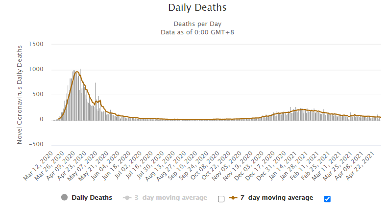
looks different than California, which did a great job until the winter surge:
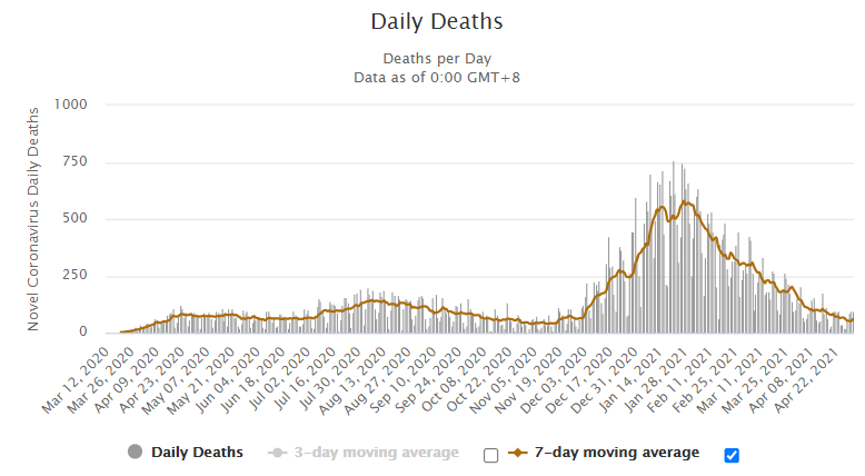
And Italy’s graph:
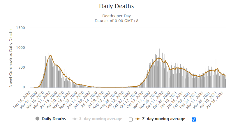
is very different than India’s:
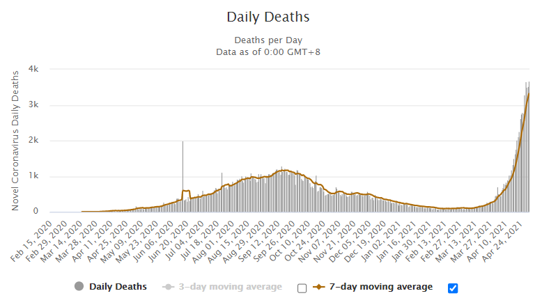
But what happens if you ignore the regional variations, and look at the progression of the disease world wide? This graph is total deaths, worldwide, cumulative:
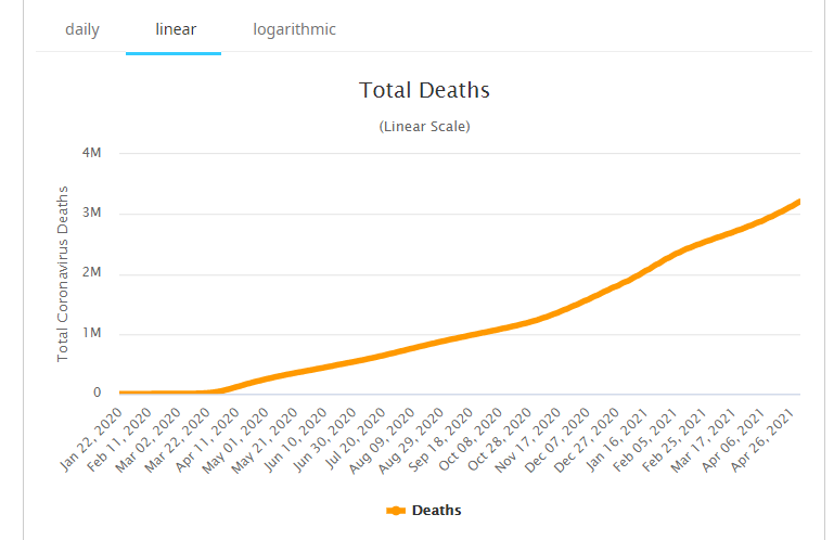
By smoothing out the county-by-county variations, it’s easy to see COVID’s steady and relentless progress. Roughly speaking, that’s two straight lines. April though October at one rate, and November to now at a higher rate (not a perfect straight line, it has a bit of a wobble).
We may be feeling pretty good in the US, but world-wide, we are no where near being out of the woods yet. Hopefully greater vaccine availability will break this curve soon.
