This post continues looking at the migration data from the IRS. This data is based on tax returns submitted by individuals, which means that financial information is available. At each geographic level (nation, state, and county) the IRS includes not only the number of tax returns submitted, but the total Adjust Gross Income (AGI) of those returns. Thus, we can determine the average income of the various types of migrants.
Let’s look at the AGI of the three basic categories of migration:
- Those who did not move, or moved within their county (the IRS data doesn’t distinguish between these two)
- Those who moved within the state (to a different county)
- Those who moved out of state
Here’s the data for the entire US, for the years 2008-2022 (all of the data in this post covers those years):
| Average AGI (per individual) | |
| Didn’t move | $35,778 |
| Moved within state | $33,828 |
| Moved out of state | $36,973 |
Of those three categories, people who moved out of state had the highest income. This makes sense for a couple of reasons. First, moving out of state is generally more expensive than moving within state, so higher-earners are more able to do this kind of move. Second, this might reflect moving to a higher-paid job. Moving out of state is a big deal; in some cases it might only be worth it if it leads to more pay. (This is consistent with another survey by the US Census, the Annual Social and Economic Supplements (ASES). It asks people for their reason for moving; those moving out of state are often doing it for job-related reasons).
What’s puzzling is why in-state movers earn less than people who didn’t move at all ($33,828 vs $35,778). The difference is about 5.4% less income, which isn’t massive but it’s certainly significant, given that the data involves over a billion tax returns. Again, the ASES survey provides a clue: a large plurality of in-state movers do so for housing-related reasons (for example, desire for better housing, cheaper housing, wanting to buy a home). On average, the income of someone struggling to afford housing is going to be less that those who already own a home and don’t want to move. Of course, it doesn’t apply to everyone who moves within state, but it does explain why the average income is somewhat lower.
One more thing about the income of in-state movers: it isn’t lower for every state. If we look at the AGI of in-state movers versus those who didn’t move, for a few states their income is actually higher. Here’s a plot:
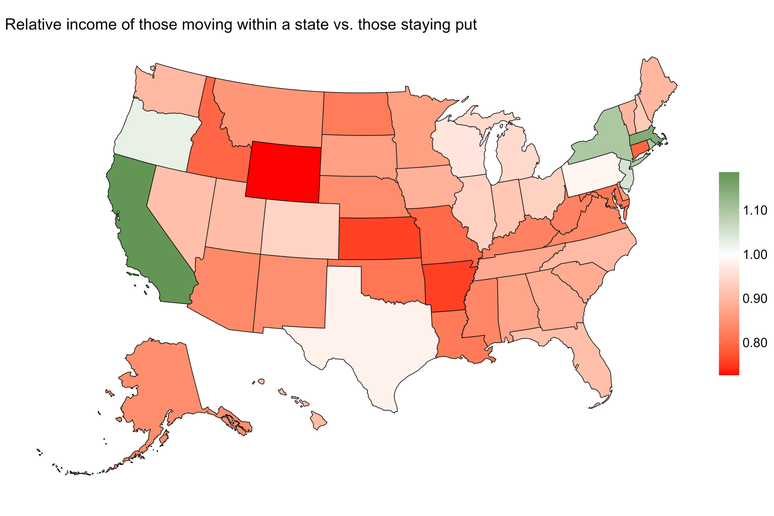
Red are states where in-state movers earn less than average; green are where they earn more. Most states are red, which is consistent with the national totals. But a few states buck the trend: their in-state movers earn more than the average. Interestingly, these states (California, New York, Massachusetts, New Jersey, Oregon) are solidly Democratic. And the in-state movers with the lowest relative income (Wyoming, Kansas, Arkansas) are strongly Republican.
Before we get too excited and make a pronouncement (“in-state movers consist of wealthy Democrats and poor Republicans”), let’s note a couple of things. First, this correlation is not 100%. There are plenty of other Democratic states where the in-state movers earn less than average. Here’s a scatterplot, by state, of Democratic voting (2024 Presidential election) against the relative income of in-state movers.
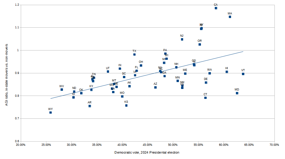
Yes, there’s a correlation line, but a lot of data points are way off of it. The r2 is 0.3, which indicates some correlation but not a strong one.
Second, correlation is not causation. Just because (some) Democratic states show a certain behavior, it doesn’t mean the behavior is caused by a high number of Democrats. More likely, there is some other factor involved that is common to these states. Or, since some Democratic states don’t show this behavior, perhaps it requires more than one component: Democratic voters and something else. I tried some other factors (state population, size, education level), but nothing jumps out. I kept searching for data to explain the difference, but at some point I realized that I was in danger of p-hacking1Performing statistical tests on the data until you find one with significant results, also known as data dredging, so I stopped. It’ll have to remain a mystery.
Let’s move on and look at the incomes of state-to-state migrations. We’ll start with those with the highest AGI:
| From | To | Average AGI per person | Migrants per year |
| Connecticut | Wyoming | $224,306 | 54 |
| New Jersey | Wyoming | $186,415 | 77 |
| New York | Wyoming | $139,249 | 234 |
| District of Columbia | Idaho | $128,331 | 29 |
| District of Columbia | Wyoming | $115,063 | 15 |
| District of Columbia | Florida | $108,340 | 1054 |
| Illinois | Wyoming | $102,883 | 302 |
| Connecticut | Florida | $97,120 | 10,032 |
| District of Columbia | Delaware | $96,361 | 125 |
| District of Columbia | Maine | $93,888 | 100 |
Basically, rich people from the East Coast moving to Wyoming. Wyoming is well-known as a landing spot of the uber-wealthy, and this table makes it clear. The final column indicates that this migration really doesn’t involve that many people. It’s just that those who do migrate are rich. At least, those who migrate from those particular states (we’ll see more about that later). With one exception, all of the migrations on this list involve a small number of (wealthy) people. The exception: ten thousand Connecticuters retire move to Florida every year. It’s a massively popular destination; more people from Connecticut move to Florida than to New York, its next-door neighbor. And apparently, it’s the wealthy ones doing it.
Let’s look at the income of people making interstate moves:
Connecticut leads the way – it’s a wealthy state, and so people who move there are wealthy too. Florida is next on the list, followed by a host of Northeastern states, then California and some other Western states. What about Wyoming, where all the billionaires were moving? It’s only a bit above average, and here’s why; for every ultra-wealthy person from the East Coast who moves in, a hundred or so normal folks from Colorado, Utah, or Idaho resettle there. That brings the average down.
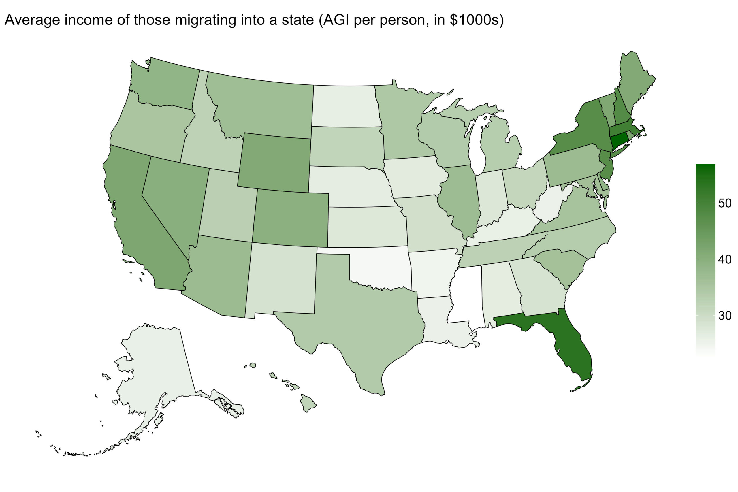
It makes sense that transplants to Connecticut are wealthy – it matches the profile of the state (second highest AGI in the country). It’s bit surprising that Florida is second on the list – it’s a relatively high-income state, but not that high (it’s 15th). Before you say “yeah, but rich retirees”, note that only 6.2% of the people who move to Florida do so to retire. That’s higher than the national average (2.6%), but not enough to explain the large difference between the movers-in and the state average. How large? Let’s plot the relative income in people moving into a state, versus the income of the people already there:
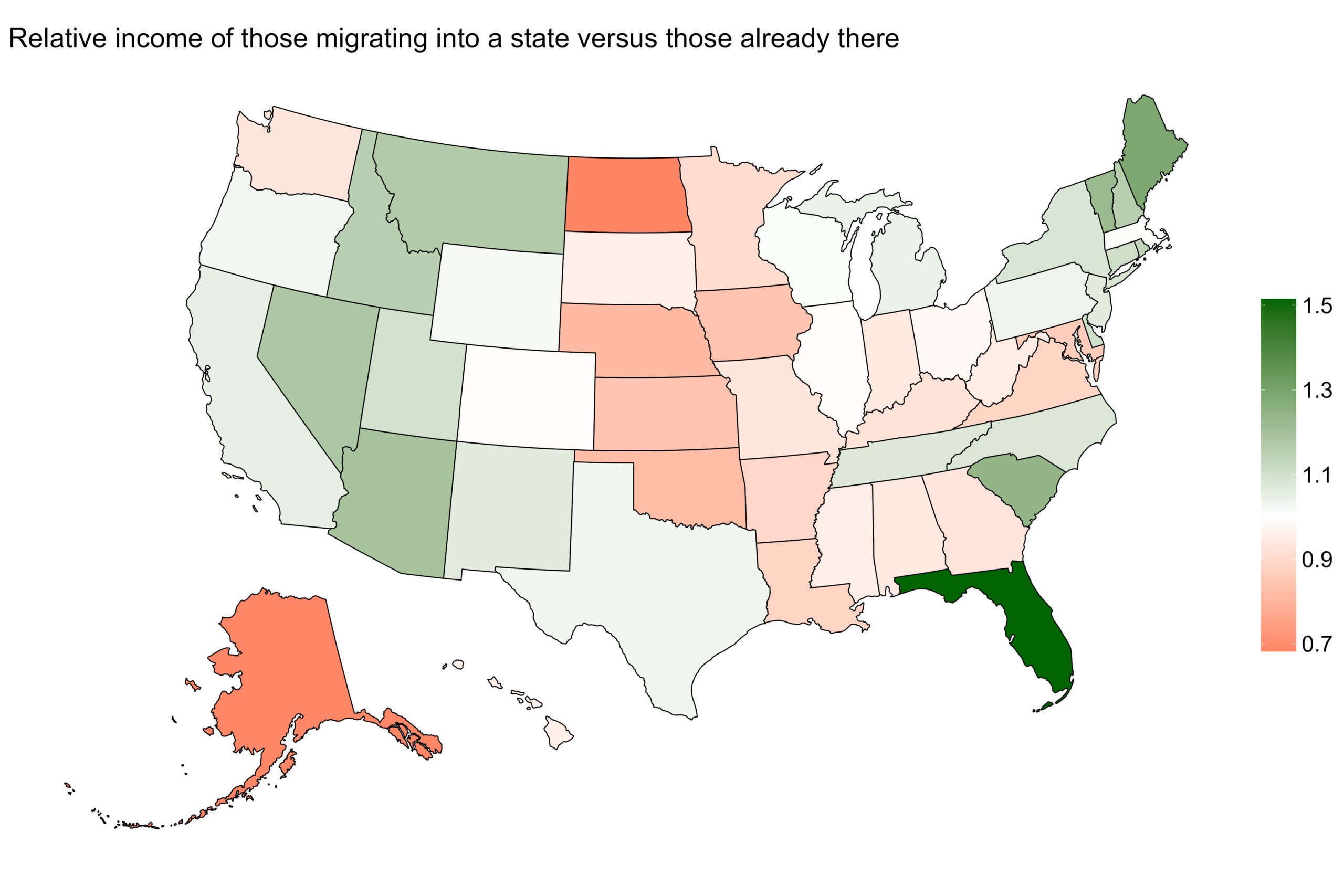
Florida leads the way; their recent migrants earn significantly more than the state average. Why? I can’t say for sure, but here’s a theory. Florida has no income tax, and no state property tax (although local municipalities can have property taxes). These two taxes disproportionally affect high earners (as opposed to flat taxes like sales tax). Someone with a healthy income looking to lower their tax burden could easily choose Florida as a destination. If enough people do this, this raises the average income of newcomers. Unfortunately, the ASES survey doesn’t have a “lower taxes” choice in its list of reasons for a move, so I can’t verify this theory. But it sounds right.
On the other end of the spectrum are North Dakota and Alaska – recent migrants earn less than the state average. You might say it has to do with oil/gas/fracking, but those industries make up a surprisingly small percentage of the jobs in those states. It isn’t clear why, but newcomers to these states have to start at the bottom.
Finally, let’s do the same type of map, but this time I’ll plot the income of those leaving a state versus those that stayed behind.
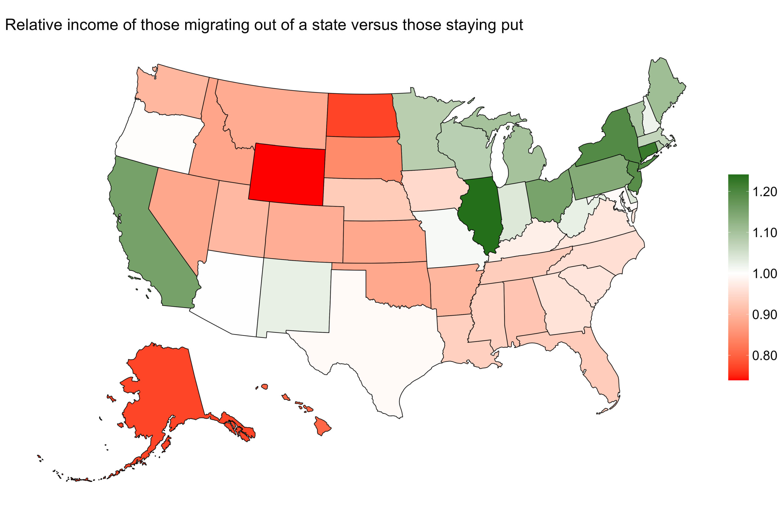
There are some pretty clear geographic trends here. Northeastern and Midwest states (and California) lost their wealthier residents, while migrants from the South and Mountain states tend to be on the lower end of the economic scale. Those leaving Wyoming are the “poorest”, relatively, but that’s just an artifact the state’s strange demographics. So many billionaires have moved there (and its population is so low) that the state has a very high average income. So if some middle class people leave the state, but none of the uber-wealthy do, the income of the movers will be “low” (relatively, but not really).
Also on the low end are North Dakota and Alaska, who we talked about earlier. Turns out when you move to these states, your income is lower than average. When you leave, it’s lower than average too. Sounds like a lot of people who moved there gave it shot, it didn’t work out, and they bailed? Just a guess.