[Apologies for the resend – the table didn’t show up in the email. You have to follow the link in the email to get the correctly-formatted post]
How do we spend our time? For twenty years the United States Bureau of Labor Statistics has tried to answer that, with a study called the American Time Use Survey (ATUS). Every year the Census Bureau contacts thousands of Americans and asks them how they spent their time during the previous day. The surveys contact a representative sampling of people ages 15 and up, and the results are analyzed and published yearly. The survey started in 2003 and the most recent results are from 2023.
There are over 400 specifically identified activities. These are grouped into main categories and sub-categories. For example, there’s an activity called Reading for personal interest. This belongs to the sub-category Relaxing and Leisure. And it is part of the main category of Socializing, Relaxing, and Leisure.
The following table shows how Americans spend their time in each of the main activity categories (each column of the table is sortable).
| Activity | Hours per day | Hours per day, if doing | Percent doing on given day |
|---|---|---|---|
| Personal Care | 09:31 | 09:31 | 99.96% |
| Socializing, Relaxing, and Leisure | 04:40 | 04:55 | 94.71% |
| Work and Work-Related Activities | 03:20 | 07:26 | 44.74% |
| Household Activities | 01:50 | 02:23 | 76.92% |
| Traveling | 01:11 | 01:24 | 84.45% |
| Eating and Drinking | 01:06 | 01:09 | 95.70% |
| Caring for and Helping Household Members | 00:26 | 01:47 | 24.68% |
| Education | 00:26 | 05:16 | 8.17% |
| Consumer Purchases | 00:22 | 00:55 | 39.43% |
| Sports, Exercise, and Recreation | 00:20 | 01:40 | 19.83% |
| Caring for and Helping Non-Household Members | 00:09 | 01:14 | 11.72% |
| Religious and Spiritual Activities | 00:08 | 01:34 | 8.78% |
| Volunteer Activities | 00:08 | 02:13 | 5.95% |
| Telephone Calls | 00:07 | 00:48 | 13.96% |
| Professional and Personal Care Services | 00:05 | 01:04 | 7.91% |
| Household Services | 00:01 | 00:46 | 1.99% |
| Government Services and Civic Obligations | 00:00 | 01:04 | 0.61% |
The left column lists the 17 main categories of activities. The next column is the average time spent per day, in hours and minutes, on that activity. The column after that is the average time spent, but only on days when the person is actually doing that activity. The last column is the percentage of respondents who do that activity on a given day.
The distinction between Hours Per Day and Hours Per Day, If Doing is important. As an example, let’s look at Work and Work-Related Activities. It says here the average American (aged 15 and up) spends 3 hours 20 minutes per day working (the Hours Per Day column). That seems low? Well, not every person is employed – some are students, some are retired, some are looking for work. Plus, even those who are employed are typically not working every day of the week. That brings the daily average down. That’s where the Hours Per Day, If Doing column comes in. It means, on days when you are doing that activity, how long do you spend doing it? In the case of work, it’s 7 hours and 26 minutes, which seems like a reasonable number. The final column (Percent Doing On Given Day), reinforces this, indicating that less than half of people are working on a given day.
This distinction shows up with other activities. Take Volunteer Activities for example. Here are two facts from the ATUS: 1) Americans average eight minutes a day volunteering. 2) On days when they volunteer, they spend more than two hours doing it. Both statements are true, and both reflect the nature of volunteer work: you don’t do it all the time, but when you do it, it takes a noticeable chunk of the day.
I’ll be looking at various Activities over the next few posts. Today, let’s start with the most common category, Personal Care. Why is it the most common? Because it includes sleeping, which almost everybody does every day. This main category is pretty simple; it consists mostly of two activities: Sleeping, and Washing, dressing and grooming oneself. Let’s answer a few questions about sleeping first.
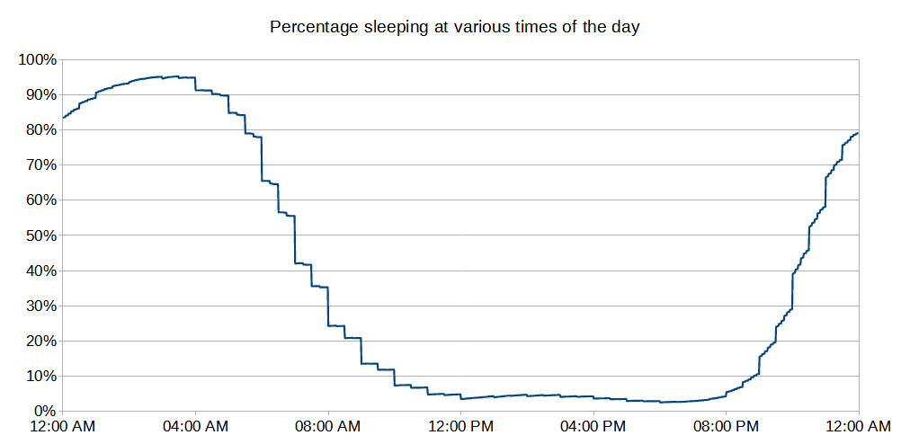
When do people sleep? Here’s a graph that shows the percentage of respondents asleep over the course of a day at different times:

A few interesting things about this graph:
- The peak sleep time is 3 AM – more Americans (95%) are asleep then than any other time. Still, that means that 5% of us are awake. Before you ask “what about sleeplessness?”, note that there is a separate category for this, and it only accounts for a small quantity of that 5%. Most of the people awake at 3 AM are supposed to be awake then. Probably because their job requires it (e.g., night shift work).
- At the other end of the scale, peak awake time is 6 PM. Only 2.6% of the population are asleep then.
- The ragged, stepped look of the chart is due to people rounding their responses to the 10- or 15-minute marks. Or, setting their alarms for a “round” time.
Women report sleeping an average of 9 minutes longer than men. The sleep differences between the sexes is a complex issue: here’s one study.
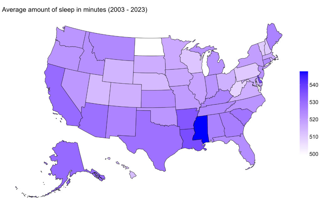
Let’s look at the amount of sleep by state:

Mississippi leads the way as the sleepiest state, while North Dakota gets the least shuteye. It’s interesting, I did some searching and found other surveys that get very different results. Some involve looking at Google analytics to determine which states search for terms like “trouble sleeping” or “sleep disorders”. Others involve contacting people and asking them how much sleep they get (“On average, how many hours of sleep do you get in a 24-hour period?”). The ATUS doesn’t specifically ask people how much sleep they got; instead it asks them for the details of all of their activities over a recent 24-hour period, and we calculate sleep from that.
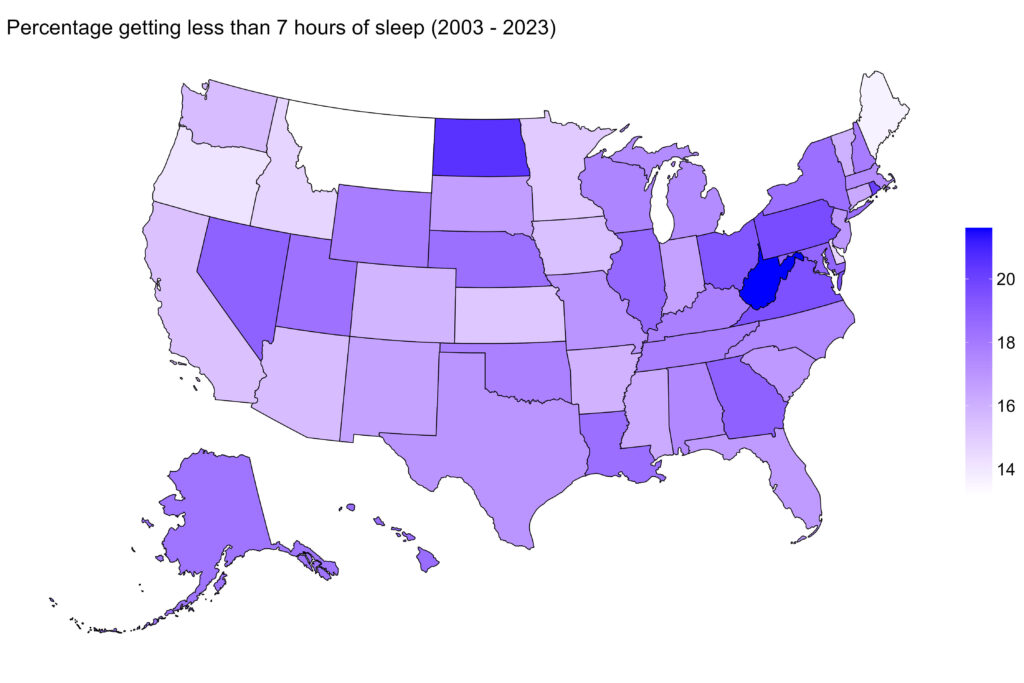
Note that the 500 minutes that North Dakotans get on average is still over 8 hours, which is plenty. For good sleep health it is generally considered best to get at least seven hours of sleep a night. So, maybe they don’t sleep as much in North Dakota, but they still get their seven hours? We can calculate this, using the same ATUS data. Here are the percentage of respondents who reported less than 7 hours of sleep:

So yeah, North Dakota definitely has a sleep problem. Not as bad as West Virginia, but still pretty bad. Interestingly, next-door neighbor Montana has the best sleep hygiene, as least by this measurement.
As I mentioned before there is a separate category for Sleeplessness. This is reported about 5% of the time, and there’s not much variation from state-to-state in the frequency of this. But there is a big variation in the length of the sleeplessness:
| State | Length of Sleeplessness |
| Hawaii | 2 hours, 28 minutes |
| Nevada | 2 hours, 2 minutes |
| Rest of the USA (average) | 1 hour, 16 minutes |
Bouts of sleeplessness in Hawaii last twice as long as the national average, and Nevada’s not far behind. Why? I have no idea. Both are tourist locations, but the ATUS surveys residents, not tourists. Maybe the weather? A warm and humid Hawaii night makes it hard to fall back asleep? I’m grasping here.
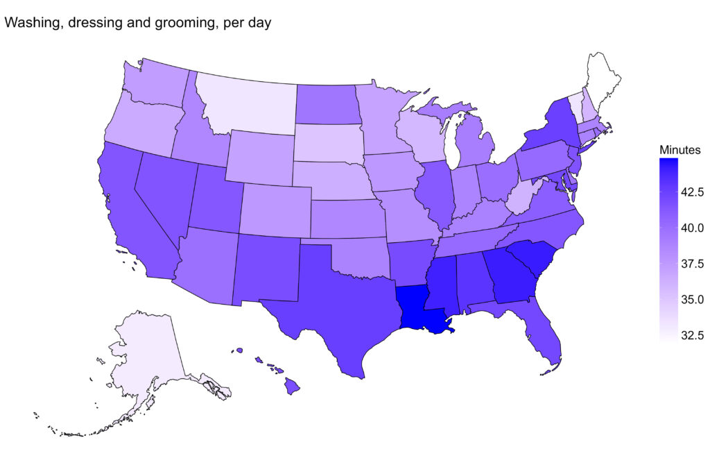
Finally, the other activity in the Personal Care category is Washing, dressing and grooming oneself. We spend an average of 40 minutes a day doing this. And yes, women spend more time than men (47 minutes vs. 33). By region:

Pretty consistently, the deep south spends more time on personal appearance than the rest of the country. Probably a cultural thing? Or maybe the weather.
Anyway, that’s it for Personal Care. I’ll move on to other ways we spend our time, next time.
