I’ve created a tool for visualizing cumulative state-to-state migration for the years from 2008-2022. Pick a state, and migration flow of interest (inbound, outbound, or net), and you’ll get a graphical representation of the migration to/from that state. Here’s an example – outbound migration from California (the darker the blue, the more migration there was to the other state.
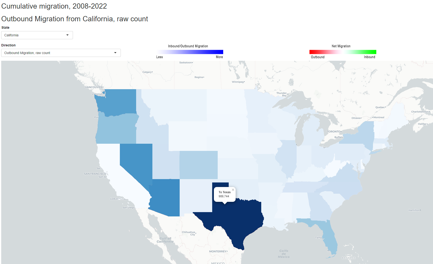
If you click on a state, you see its migration numbers (in this case, 989,744 Californians migrated to Texas from 2008-2022).
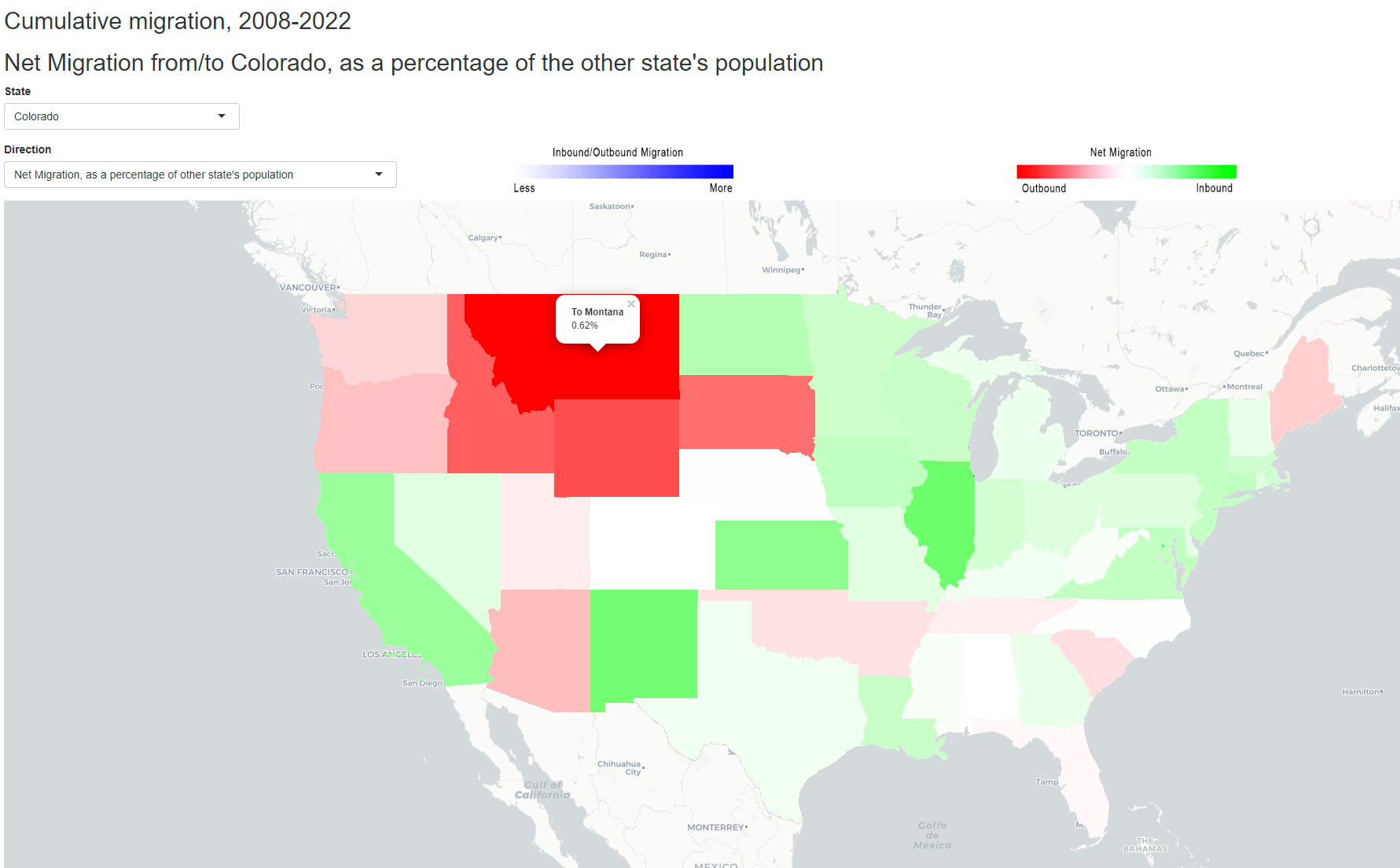
Below is an example of a net migration map. Green represents net migration inbound to the state, red is net migration outbound from it. This map is for Colorado, and it’s not based on raw numbers like the one above, but on the percentage of the population of the other state. So in this case, there was net migration out of Colorado to states to the north (e.g., Montana), but net migration into Colorado from the Midwest and East (and California).
Click here bring up a new browser tab with the tool. This wants a big screen; I strongly recommend doing this on a desktop or laptop computer. A tablet will work okay.