As I mentioned in my previous post, the US Census place-of-birth data is available at the census tract level. Wouldn’t it be nice to visualize this, by looking at a map of a state? And be able to zoom down to cities and neighborhoods, and see the differences from tract to tract? Well, now you can.
Select a state from the list at the end of this post and hit Go. Wait a few seconds (the dataset is large, so it takes a while to load). You’ll see a map of the state, with each census tract shaded based on the percentage of residents born out of state. At the whole state level, rural areas will stand out. Zoom into the cities to see their tightly-packed census tracts.
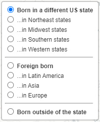
There are several ways to filter the data, based on the chooser in the upper right:

Each option shows you the relative percentage of residents, in each tract, for the criterion you selected. The darker the blue, the higher the percentage. Note that the scale of the color is relative to the map you are viewing; the darkest blue always means “the most”, but “the most” might be 2% on one map, and 50% on another. If you click on a census tract, you get a pop-up bubble containing details – and the contents of the bubble are different depending on which layer is active.
I recommend doing this on a PC – the performance on smart phones and tablets can be iffy, especially with larger states. Be aware that the California map is very large – it won’t even load on a smart phone or tablet (PC is fine). So I also provide California in two halves (north/south).
So have a look! Check out where you were born, other places you’ve lived, or just pick a random state and start zooming in.
Notes: 1) The Foreign born section only has filters for Latin America, Asia, and Europe. The other three regions (Oceania, Canada, and Africa) are so uncommon that the margins of error were a big issue. You can still see the percentages for those regions in the pop-up. 2) The text in the “foreign born” pop-up only list regions with values > 1%. 3) Discerning readers might notice that the “Total born out of state” for a given census tract (shown in the pop-up) is sometimes slightly larger than the sum of its two components (“Born in a different US state” and “Foreign born”). That’s because there is a third category: Native US citizens born outside of the US, either in territories (Puerto Rico, Guam), or to parents stationed overseas. Typically this about 1% of the population. I ignore this data in these maps.
