Let’s look at other ways to visualize how America has aged in the past fifty years. At the end of the previous post, I introduced histograms based on ten-year age ranges. Here’s a different view of the same data, comparing 1970 with 2020
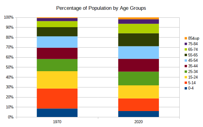
In 1970, the red and yellow layers (ages 5-24) were the baby boomers, and they dominated the chart. Not anymore – the middle layers of the cake are all pretty much equal1At least, the six layers from red up to dark green.. Let’s add the decades in-between:
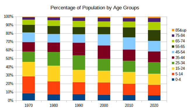
The charts above show the relative population of each age group: for each year, the bars total to 100%. This helps visualize the change: the higher-up layers (older population) get thicker as the years go by. And maybe it provides an allegory (the crushing weight of retirees, resulting in younger Americans getting squished, or something).
There is another way to view the data: by total population.
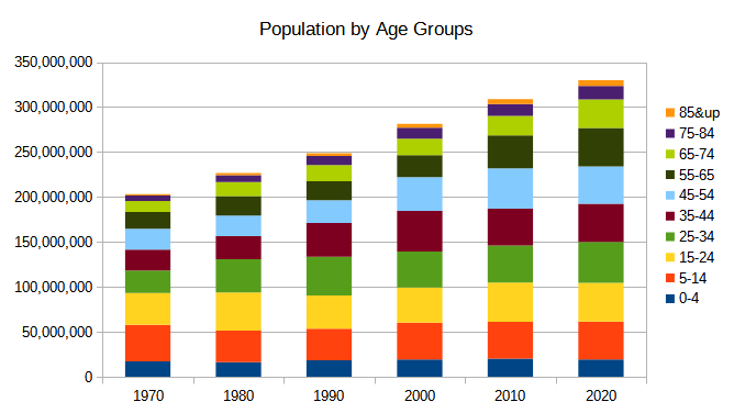
In this chart, the height of each layer and each bar is determined by actual population, not percentage.
Two similar ways of visualizing the same data. Look at the red slice (5-14 year-olds), for example. In the top chart (percentage), the red segment starts at 20% of the population in 1970, and drops to 12% in 2020. In the bottom chart (total population), the red segment is roughly the same size (1970 vs 2020), but the ‘older’ bars are larger and the stack is much taller. Two ways of saying the same thing: there are proportionally fewer youngsters than fifty years ago.
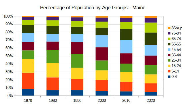
You can do these charts at the state level too. Here is Maine, the oldest state in the country, and one that aged the fastest too (its median age grew by 16 years over the past 50):
Wouldn’t it be nice if there was a way to display the age bars for all 50 states in one graphic? Well, there is: a “net chart”. It’s kind of like a pie chart on steroids. Here’s the chart for the same population groups, across all states, in 1970:
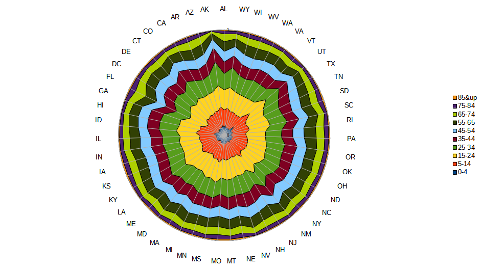
The age groups start in the middle and work their way out (using the same colors as the other charts). Each state is a wedge of the pie. Older states (e.g., FL) push the layers towards the middle, and younger states (e.g., UT) push it outwards. Since this is the data from 1970, you’ll notice how large the red and yellow layers near the middle area. Yes, the same old boomers.
I’m sure you’re wondering, yeah that’s cool, but can’t we see this same chart over time? Well, yes, you can:
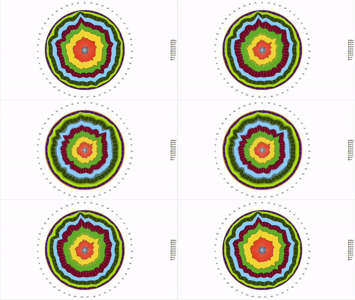
This chart cycles from 1970 to 2020, and then back to 1970, and then repeats. When the inner rings are biggest, that’s 1970. You can watch our country age as the rings collapse toward the middle (and expand outward as time reverses). Or, pick and ring and see how it changes over time. Or, just stare at it; it’s kind of mesmerizing.

Nothing to surprising I’d say. Except maybe on the the 1970 chart, I think I see a larger Gen X (birth years 63-75 or thereabouts) population than I expected? This is the time when effective birth control reached wide distribution. It looks equal or greater than baby boom years. My conclusion, lots of factors contribute to a outcome.
Also, I’ve had three life changing/saving surgeries over the last thirty yearsthat technically weren’t available to my grandparents, and to some degree my parents.
It might be fun to see exact same charts for our neighbors to north and south. Canada, I suspect, might look roughly like us.
Mexico, I couldn’t begin to guess.
Cheers, B