The US is getting older. No surprise there; they’ve been talking about it for years now. Here’s how the median age of US residents has changed over the past 50 years:
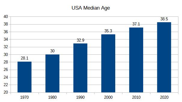
In less than a lifetime the median age of Americans has increased by ten years – pretty remarkable (it’s even more dramatic in some other countries). What are the causes? A lower birthrate, and improved lifespan for elderly.1Note that “improved lifespan for elderly” doesn’t just mean “better medical treatment”. For example, the fact that smoking has dropped from 42% of the population (1965) to 14% (2020) is an important factor in elder longevity too. Fewer babies + more old people = increasing median age.
Let’s look at how have things changed at the state level. Here’s an animation showing how the median age has increased from 1970 to 2020:
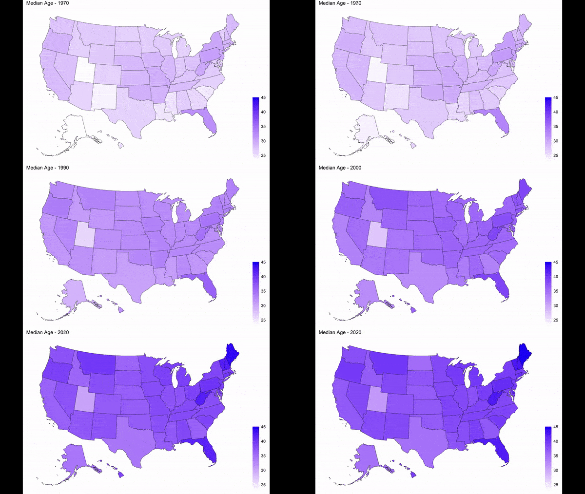
Every state got older. In fact, in 2020 just about all of the “young” states are older than the “old” states from 1970. There’s only the tiniest overlap: the oldest state in 1970 (Florida, 32.3) is just slightly older than the youngest state in 2020 (Utah, 31.3). Florida is still the oldest state, but others are catching up.
Not all states aged at the same rate. Here is the change in median age, from 1970 to 2020:
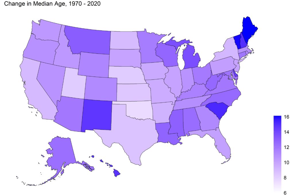
South Carolina, New Mexico, and the northern New England states got old, fast. On the flip side, Utah started young and stayed relatively young (all of those Mormon babies, no doubt).
Median age is fine, but a more subtle way to look at the age of a population is a histogram that breaks them into age brackets. Here’s what the population looked like in 1970:
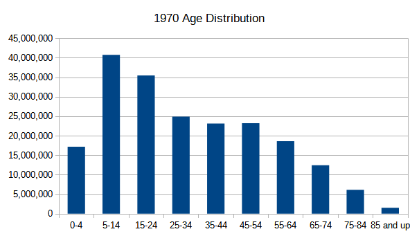
(Note: over the past 50 years, the census has changed the categories it uses when tabulating age data. To get age ranges at consistent intervals over this time period requires using 0-4, then 5-14, 15-24, 25-34, and so on. Other than the 0-4 data, all of the other bars represent a 10-year period. Well, except for the last one…)
In the chart above, the two tallest bars consist of the baby-boomers. They dwarf all of the other age groups. Compare to the 2020 data:
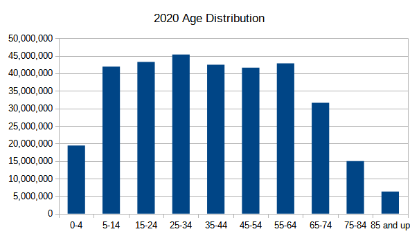
Quite a difference. Now, there are six age groups of roughly all of the same population (5-14 through 55-64). An indication of how much things have changed: 1970, the 5-14 age group outnumbered the 55-64 category by more than 2-to-1. Now, there are actually more of the old-timers than the youngsters.
Next time, I’ll use these histograms to dig deeper into how states and counties have aged.

Some things I’ve read about recently. South Korea’s situation has become critical:
https://www.npr.org/2023/03/19/1163341684/south-korea-fertility-rate
World and US populations are expected to hit a ceiling by end of century:
https://en.wikipedia.org/wiki/Projections_of_population_growth
I’m sure your next post will mirror these findings.