One last look at the graying of America, this time at the county level. Let’s start with the extremes. The county that aged the most dramatically over the past 50 years is Sumter County in Florida. In 1970, its median age was 30. By 2020, it jumped to 67.3. The explanation is pretty straightforward: the creation of The Villages, a master-planned age-restricted community. In other words, a bunch of seniors moved into a newly-created city. The county’s population has nonupled1gone up by a factor of nine since 1970, and a vast majority of the newcomers are old-timers.
That’s one way to increase the median age of a region – bring in a bunch of old folks. Another way is to keep the population the same, and just let everyone age. That’s the case of the county that’s next on the list: Mora County, New Mexico. It’s population pretty much held steady; it just got older. Here’s 1970 -> 2020:
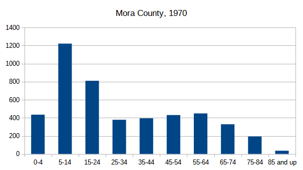
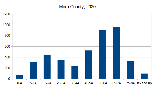
Take the two tall bars from 1970, and shift them 50 years to the right, and lo and behold, you see two tall bars in 2020. The baby boomers got old, and not many youngsters came into replace them. That adds up to an increase in the median age from 23 to 57.
Almost all (98%) of the counties in America got older since 1970. But a few got younger. The most dramatic is Pasco County, Florida2Which, interestingly enough, shares a border with Sumter County. In 1970 Pasco County had a median age of 53.3, which made it the second oldest county in the entire country.
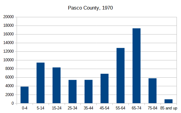
In the fifty years since, its population grew by leaps and bounds (7.5x), as Pasco towns became popular bedroom communities of Tampa and St. Petersburg. The newcomers, while not exactly spring chickens, have brought the median age down to 44.2. It’s the same explanation as Sumter County: bring in a bunch of new people to skew the average, in this case, downward.
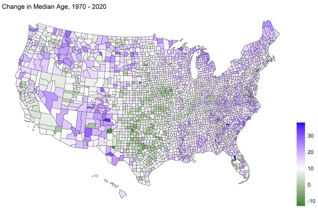
The following graphic shows the amount of aging in each county in the US from 1970 to 2020. Dark blue represents the largest change in median age (30+ years). Lighter shades represent less of an increase, all the way down to white which means no change in the median age. The few counties whose median age dropped are shown in green.
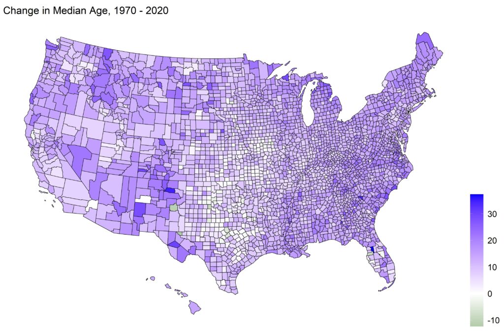
What jumps out at me is the patch of counties in the south central part of the country, Nebraska, Kansas, Oklahoma, parts of Missouri, into Texas. Within this patch, there are many counties that haven’t aged much, or at all (colored white or nearly-white). Let’s change the coloring of the map to make it more obvious:
In this map, the color white indicates a county is aging at the US average; anything green is lower than average. Now that swath of counties is more obvious (and green). These places have bucked the trend of an aging country, and I would not have guessed that. Texas, I can see, because of strong economic growth and migration from other states. But those other states? The narrative about small-town mid-America is that the towns are shrinking, getting older, as young people who don’t see a future move out as soon as they can. But if that was the case, you’d expect an aging population in these counties. You see lots of aging in the South, industrial Midwest, and the Northeast. But in this little swath of former dust-bowl counties, not so much.
I can’t explain it (not without a grant :). Those states do have a higher fertility rate than the US average, so that explains part of it – more kids means a lower median age. But a back-of-the-envelope estimate indicates that this can only account for a year or two of the median age difference. So something else is going on. Perhaps the old folks in these counties move somewhere else? That would bring down the average age. Unfortunately, the migration data doesn’t break down by age, so there’s no way to tell if elderly Nebraskans are moving away at a high rate.
Or maybe the common narrative just doesn’t apply to these counties, and the kids stick around.
