I’ve been looking representative neighborhoods across the nation. Previous posts looked at a series of characteristics, here (Age, Race) and here (Ethnicity, Sex, Household makeup). Today I’ll continue, starting with the question of Homeownership. The census question this is based on is simply: do you own or rent your current housing unit? The national average is 63.1% ownership, 36.9% rental. So the closer a census tract comes to this ratio, the more typical it is for this characteristic.
The first thing that jumps out at you is the distinction between urban and rural tracts. Ownership is much more common in rural settings (80%) than urban (55%). Your instinct might tell you that’s because cities have more apartments, and apartments are usually rented. Turns out your instincts are correct: apartments are rare in rural settings (about 5% of housing units) and much more common in urban areas (about a third). This difference pretty much completely accounts for why there is less ownership in urban environments.
There’s a wide range of homeownership across the nation. Here’s a graph of the number of census tracts, for each percentage of homeownership
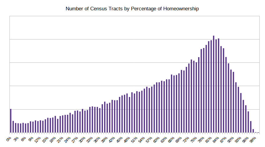
It peaks around 83%, but really there are tracts with rent/own ratios all over the map.
Next, Education. So far I’ve been able to use the decennial census data, which is the survey completed by, in theory, all residents of this country. However, starting with this category, the questions aren’t asked by the full 10-year census. Instead, I’ll rely on the American Community Survey, which is done by the Census Bureau each year but only on a subset of the population. The numbers are trustworthy, just with a higher margin or error. I use the most recent 5-year rolling averages to increase the reliability of the data. The ACS queries Americans about the level of their educational attainment. Here’s the list, along with the percentage of US adults who reached each level.
| Educational Attainment | Percentage of US adult population (age 25 and older) |
| Less than 9th grade | 4.6 |
| 9th to 12th grade, no diploma | 5.5 |
| High school graduate | 25.7 |
| Some college, no degree | 18.5 |
| Associate’s degree | 8.8 |
| Bachelor’s degree | 22.1 |
| Graduate or professional degree | 14.7 |
The closest match is tract 327.02 in Gaston County; North Carolina, as suburb of Charlotte:
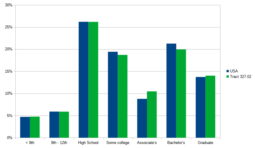
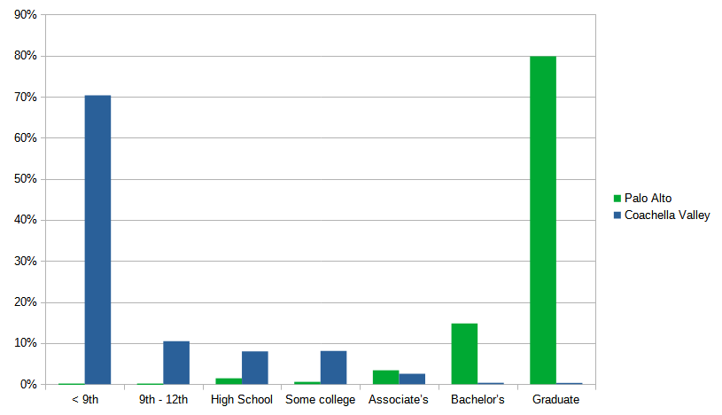
Pretty close to an exact match. On the other ends of the spectrum are these two tracts in California: one near Stanford University, the other in central valley farm country:
There’s a lot of analysis of this education data in a post I wrote a three years ago, so I’ll just move on to the next category: Income. The ACS queries yearly household income over a series of ranges. Here are the US averages:
| Household Income | US Percentage |
| Less than $10,000 | 4.9 |
| $10,000 to $14,999 | 3.6 |
| $15,000 to $24,999 | 6.6 |
| $25,000 to $34,999 | 6.8 |
| $35,000 to $49,999 | 10.4 |
| $50,000 to $74,999 | 15.7 |
| $75,000 to $99,999 | 12.7 |
| $100,000 to $149,999 | 17.4 |
| $150,000 to $199,999 | 9.3 |
| $200,000 or more | 12.6 |
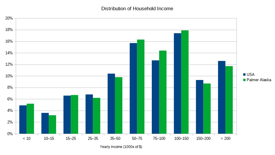
You have to go a long way to find the community whose income profile most closely matches the US: it’s way up in Palmer, Alaska (about 45 minutes outside of Anchorage). Here’s what it looks like compared to the national averages:
The survey provides two other data points for each tract: the mean (average) income, and the median (midpoint) income. Why didn’t I just use those instead? Average/mean has a big problem: it can be skewed by a single large data point. Like the old saw: what happens when Warren Buffett walks into a bar? The average net worth of everyone in the bar is now a billion dollars.
Well, what about using median income instead? Median is the midpoint – that is, when incomes are listed from highest to lowest, pick the one in the middle. This technique eliminates the “Warren Buffett” problem. But it can still mask variations in the distribution. For example, let’s look at census tract 9701.01 in Stanton, Kentucky. Its median household income is practically identical to the national median: $78,535 vs $78,538. But take a look at the distribution in the various income ranges:
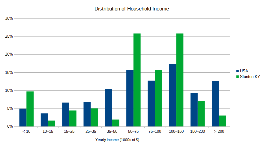
That’s not a very good match to the national profile. Some categories are much higher, some substantially lower. The midpoint matches that of the United States, but the rest of the distribution doesn’t. It turns out that when you compare each of the ten ranges, Stanton is below average: 53,094th in a list that is over 84,000 long. So even though its median income matches that of the US, it is far from representative. That’s why I compare each of the income ranges, to see who best fits the curve.
I know I’m supposed to be finding typical neighborhoods, but I can’t help but look at the extremes too. Looking at each income bracket, here are the census tracts that have the highest percentage of households that fall within that bracket
| Income Bracket | Tract | Details | Percentage of Households in this bracket |
| < $10,000 | 9.02; Knox County, Tennessee | University student housing | 80.0% |
| $10,000 – $15,000 | 9805.01; San Francisco | Low income senior apartments | 81.3% |
| $15,000 – $25,000 | 205.04; La Paz County; Arizona | Manufactured homes community in desert | 57.4% |
| $25,000 – $35,000 | 102.06; Wakulla County; Florida | Rural panhandle | 55.3% |
| $35,000 – $50,000 | 4.01; Hardin County; Ohio | Near Ohio Northern University | 67.9% |
| $50,000 – $75,000 | 122, Centre, PA | Penn St University housing | 100.0% |
| $75,000 – $100,000 | 1074.07; Oklahoma County | 78.4% | |
| $100,000 – $150,000 | 9804; Santa Barbara | Next to Vandenberg AFB | 70.7% |
| $150,000 – $200,000 | 1131.12; Salt Lake County | A very nice suburb of SLC | 57.9% |
| > $200,000 | 615.05; San Francisco | High-end block in South Beach of San Francisco | 95.8% |
Interesting that three of these are college communities. The first is student housing consisting of full time students who are part time workers. This is a fairly common situation – a census tract full of students earning a bit of cash. The University of Tennessee just happens to top the list.
The next two college-related neighborhoods are middle income pockets adjacent to colleges in Ohio and Pennsylvania. The Penn State tract is remarkable – every single household falls within the same income range ($50,000 – $75,000). That’s too low to be professors, but since they are living on campus, they are likely employees of the University. Maybe non-professor lecturers/instructors?
The final tract in the list is a single block in the South Beach section of San Francisco (south of Market). There are a couple of high-end condo towers that house around 1000 people, roughly 530 households. Of those, all but 22 have incomes above $200,000. Tech/AI boom, anyone?
My next post will cover the last of the categories: Political Lean, and then I’ll sum everything up and see which tracts are the most representative of the whole country, cumulatively across all of the categories.