Last time I started looking for “representative” neighborhoods – that is, those that approached the national average in various categories. I covered age and race previously; let’s continue with Hispanic/Latino Heritage. Remember, this is treated by the Census as an ethnicity, so the tallies are independent from race. This is a yes/no question: is your origin Hispanic or Latino? The national average is 18.73% yes.
To determine how representative a tract is, it’s a simple calculation: the closer a census tract is to this number, the better. The winner is Census Tract 9501 in Gillespie County, Texas, which comes in at…18.73%. We actually have to go out several decimal points until it diverges from the national average: 18.7296 vs 18.7299. A tiny sliver of a person.
Here’s a histogram of the number of census tracts, by percentage Hispanic heritage:
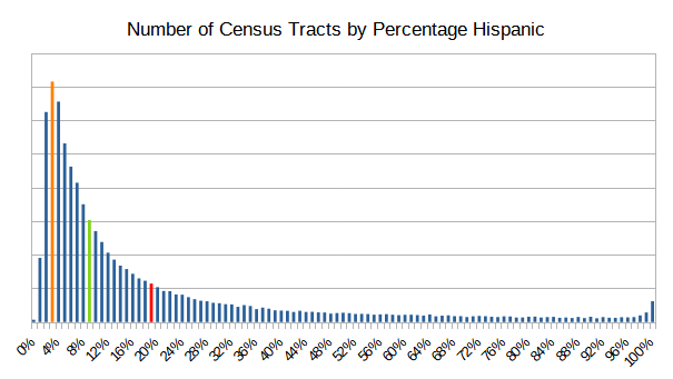
But wait, didn’t I say that the average was 18.73% Hispanic? Doesn’t look like it here. Well, here’s a nice lesson in the difference between average, median, and mode. The national average is 18.73% Hispanic (red line). The median census tract (that is, if you rank them from highest to lowest by percentage Hispanic, it’s the one in the middle) is 8.8% Hispanic (green). And of all of the tracts, the mode (most common) Hispanic percentage is 3% (orange). All different numbers, and all true. Just one of the things that can happen with a skewed (asymmetrical) distribution.
Next, Sex. Like Hispanic heritage, this is another binary question – in this case, the answer is either Male or Female. The US is 50.92% female, 49.08 male. Unlike Hispanic/Latino, the distribution is tight and symmetrical:
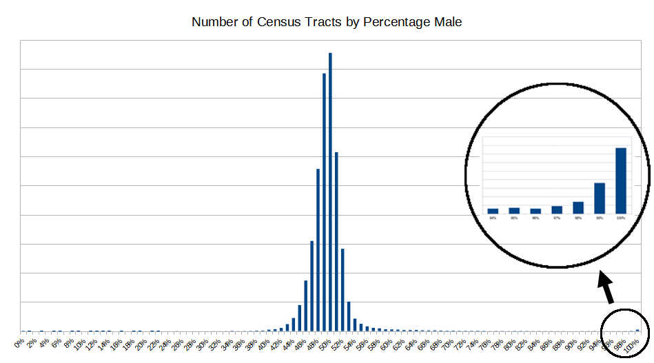
A vast majority of census tracts are centered on the midpoint. In fact 85% of census tracts are between 47 and 52 percent male. The extreme outliers are typically correctional facilities (see the right end of the chart, expanded).
Could that variation be just random chance? To test this, I ran a program that randomly assigned sex (male/female) to every person in every tract in the US, and then built a similar histogram. The shape is similar, but it’s even tighter than the real one: 99.3% of the tracts are within that 47-52% interval, as opposed to 85% in real life. Bottom line: in real life most tracts are in the expected middle range (47-52% male), and there are a few are massive outliers (prisons and other same-sex dormitory situations). But what about the tracts that are just outside of the middle range? What explains the neighborhoods that are leaning female (54-60% women) or leaning male (53-59% men)? I.E., these:
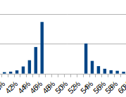
A couple things I noticed. First, the leaning-female tracts are older than those who lean male. The median age is 12% greater, and the percentage over age 65 is significantly higher (21% versus 13%). This makes sense; on a whole men die younger than women, so if you have an aging neighborhood, a few more men than women will “age out”, and the population of women will rise above the average. But the most interesting difference between these two sets of census tracts is that the leaning-female tracts are almost exclusively urban. There are very few rural neighborhoods where women are 54-60% of the population (on the other hand, leaning-male tracts have an appropriate urban/rural distribution). We shouldn’t get carried away here; there are plenty of women living in rural areas. But for whatever reason, it is very rare to find a rural neighborhood where women make up a more-than-expected percentage of the population.
The next category is Household Configuration. The census defines a set of household types, based on habitation type, and children. Basically, couples (married or not, with children or not) and singles (living alone, with children, or others (i.e., roommates)). This results in ten categories, totaling to 100%. Here’s the distribution for the US as a whole:
| Household Type | Percentage of Households |
| Married couple, no children | 28.7 |
| Married couple, with children | 17.6 |
| Cohabiting couple, no children | 4.6 |
| Cohabiting couple, with children | 2.3 |
| Male, living alone | 12.6 |
| Male, with own children | 1.6 |
| Male, with others | 4.6 |
| Female, living alone | 15.0 |
| Female, with own children | 5.2 |
| Female, with others | 7.8 |
Slightly more than half of households (53.2%) are couples, the first four categories on the list. The remainder are “singles”: men/women either living alone, or with their kids and no spouse, or with others (roommates). Interestingly, the percentage of women in these single households far exceeds men (27.9% to 18.8%). What can explain why there are 50% more women than men who aren’t attached? That works out to about 11.5 million more “single” women than “single” men. Let’s do some accounting.
Start with the fact that there are 1.82% more women than men in the US. That gets us 6 million right there. The next thing to consider is age-based, as shown in this chart:
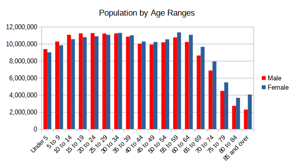
Men outnumber women in childhood and early adulthood. But by about age 30, women start outnumbering men. Household types are based on adults (kids are part of households, but they aren’t the primary component). Counting just adults, there are 8 million more women than men. That’s closer to 11.5, but we’re still short 3.5 million.
The last factor are people who are in atypical households – the census calls them Group Quarters. These can be divided into Institutional and Non-Institutional. The former means incarceration (prisons, jails). The later represents college dorms, military housing, shelters, group homes, etc. Men outnumber women by 1.2 million in Institutional settings, and 2.2 million Non-Institutional. Add those two together, and you have the missing 3.5 million.
Anyway, back to census tracts. Which neighborhood has the most typical set of households? It’s in north Las Vegas, tract 33.02. Here’s how it compares to the national averages
| Household Type | USA | Tract 33.20, Clark County, NV |
| Married couple, no children | 28.7% | 28.7% |
| Married couple, with children | 17.6% | 17.5% |
| Cohabiting couple, no children | 4.6% | 5.1% |
| Cohabiting couple, with children | 2.3% | 2.3% |
| Male, living alone | 12.6% | 12.4% |
| Male, with own children | 1.6% | 1.7% |
| Male, with others | 4.6% | 5.1% |
| Female, living alone | 15.0% | 14.0% |
| Female, with own children | 5.2% | 5.3% |
| Female, with others | 7.8% | 8.0% |
Remarkably close, no? The top ten are nicely scattered across the country, in a mixture of different sized towns
| Tract | County | State |
| 33.2 | Clark County (Las Vegas) | Nevada |
| 136.08 | New Castle County | Delaware |
| 519.12 | Johnson County (Kansas City) | Kansas |
| 9752 | Scott County | Tennessee |
| 219.02 | Orange County | Texas |
| 709.02 | Harnett County | North Carolina |
| 5251.01 | Plymouth County | Massachusetts |
| 721.12 | Pierce County | Washington |
| 122 | Shasta County | California |
| 7704 | Cook County (Chicago) | Illinois |
Those are the normals. The extremes are sometimes more interesting – I’ll break down some of the categories.
- Married Couple, No Children – The tracts with the highest percentage of these households are retirement communities. No surprise there.
- Married Couple, With Children – At the state level Utah leads the way here. But at the tract level, the highest percentages are communities of Hasidic Jews in New York and New Jersey. 75-80% of the households in these tracts are married couples with kids. Lots of kids.
- Cohabiting – Overall, marriage is favored over cohabiting by about 7 to 1. But, there are several neighborhoods in Portland where 15-20% of the households are unmarried couples. In most of these, the unmarried couples outnumber the married couples. There’s also a pocket of tracts in the Greenpoint/Williamsburg areas of Brooklyn a similar profile. Both areas are young, urban, hip, well-to-do. And apparently, not interested in tying the knot.
- Single Parent – The ratio of single moms to single dads is about 3:1 (5.2% of households, to 1.6%). But this difference is magnified when you break it down at the tract level. For example, there are no census tracts where single dads make up at least 20% of the households; there are 545 tracts where single moms reach that level. If I lower the threshold to 10% of the households, we get a grand total of five tracts where men reach this level; with women, 8764 tracts qualify.
This last point just goes to show that there are different ways of slicing the same data. Two things are true:
- There are about three times as many single mom households as single dad households.
- Take all the census tracts where either single mom or single dad households are noticeable (> 10% of households). It’s 1700 times more likely to be single moms.
That’s it for now, we’ll pick up next time with the next category, Homeownership.