I’m going to try to answer the question, what is the most representative neighborhood in America? In other words, which small community reflects the overall makeup of this nation?
The first thing to do is to define a neighborhood. I’m relying on census data, so it’s got to be a geographic area that the census measures. The best option is census tracts, which average around 4000 people. Maybe that’s a bit larger than what you think of as a neighborhood, but it’s about as small as you can get with census data.1There’s a geographical unit that’s smaller, the “block group” (averaging about 1400 people, so each tract typically consists of three block groups). But these are so small that the margin of error for the ACS surveys is unacceptable. Call it an “extended neighborhood”.
Next, how do I determine what makes a neighborhood “representative”? What demographic characteristics should I consider? Here’s what I came up with:
- Age
- Race
- Latino/Hispanic ethnicity
- Sex (male/female)
- Household makeup (marriage, kids)
- Homeownership vs. renting
- Education
- Income
- Political lean
(One more thing I’d like to include on this list, but can’t, is religious beliefs and activities. The Census bureau is by law prohibited from querying about religion. Other studies of religion do not report results at the census tract level.)
I’ll look at each of these nine characteristics individually, determining how close each census tract comes to the national average. Then, I’ll find the tract that scores best across all nine. Spoiler alert: This is a lot of ground to cover, so I won’t be finishing in this post.
Let’s dive into each of the characteristics. I’ll start with Age. From the 2020 census, here’s the profile of the US population, divided into eighteen age ranges:
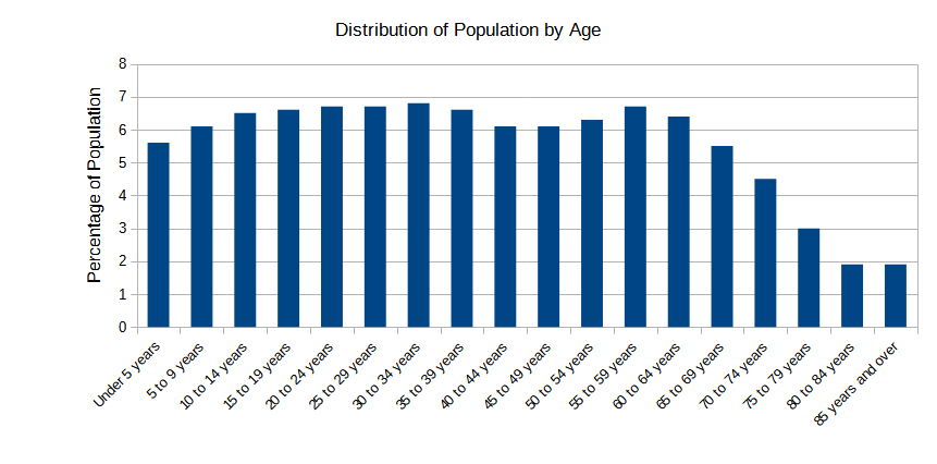
I need to determine how close a census tract matches this national average. I’ll go into detail on the technique I use so you’ll understand it; I’ll do it the same way for other categories as well. Here’s the process: for each of age group I calculate the difference between the national value and tract value. I add all of these up to get the total variance. The lower the total, the closer the tract is to matching the national profile.
To make this technique clear, here’s an example using the census tract that I live in: tract 1012 in Santa Cruz County, California. This table compares it to the national distribution by age groups, showing the difference between the US value and the tract value. The difference is first expressed as percentage, then the raw value (percent x 100). The differences are totaled at the end.
| Age Group | USA | Tract 1012 | Difference (%) | Difference |
| Under 5 years | 5.551% | 3.034% | 2.518% | 0.02518 |
| 5 to 9 years | 6.073% | 2.947% | 3.126% | 0.03126 |
| 10 to 14 years | 6.525% | 4.305% | 2.220% | 0.02220 |
| 15 to 19 years | 6.648% | 5.056% | 1.592% | 0.01592 |
| 20 to 24 years | 6.688% | 9.101% | 2.414% | 0.02414 |
| 25 to 29 years | 6.728% | 5.923% | 0.805% | 0.00805 |
| 30 to 34 years | 6.798% | 5.172% | 1.627% | 0.01627 |
| 35 to 39 years | 6.600% | 6.588% | 0.012% | 0.00012 |
| 40 to 44 years | 6.127% | 6.299% | 0.171% | 0.00171 |
| 45 to 49 years | 6.078% | 6.212% | 0.134% | 0.00134 |
| 50 to 54 years | 6.252% | 7.050% | 0.798% | 0.00798 |
| 55 to 59 years | 6.674% | 6.674% | 0.001% | 0.00001 |
| 60 to 64 years | 6.423% | 7.801% | 1.379% | 0.01379 |
| 65 to 69 years | 5.518% | 8.755% | 3.237% | 0.03237 |
| 70 to 74 years | 4.472% | 7.050% | 2.578% | 0.02578 |
| 75 to 79 years | 3.004% | 3.236% | 0.232% | 0.00232 |
| 80 to 84 years | 1.928% | 2.687% | 0.760% | 0.00760 |
| 85 years and over | 1.912% | 2.109% | 0.197% | 0.00197 |
| Total | 0.23800 |
Graphically, it looks like this:
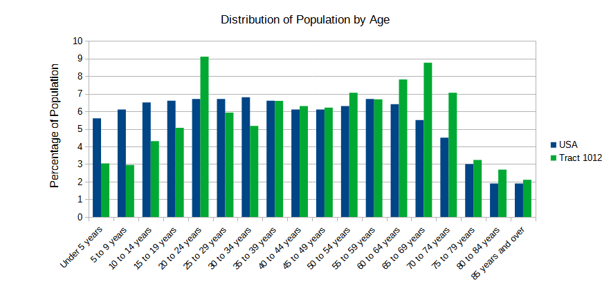
This shows that our neighborhood doesn’t have many kids, a spike of college-age residents (UCSC is nearby), and an excess of older folks. Sounds about right! The sum of differences indicates how close this tract is to the national distribution. In this case, the sum (total variance) is 0.238. How does this compare with other tracts? It ranks 53,463rd (of about 84,000), somewhat below halfway.
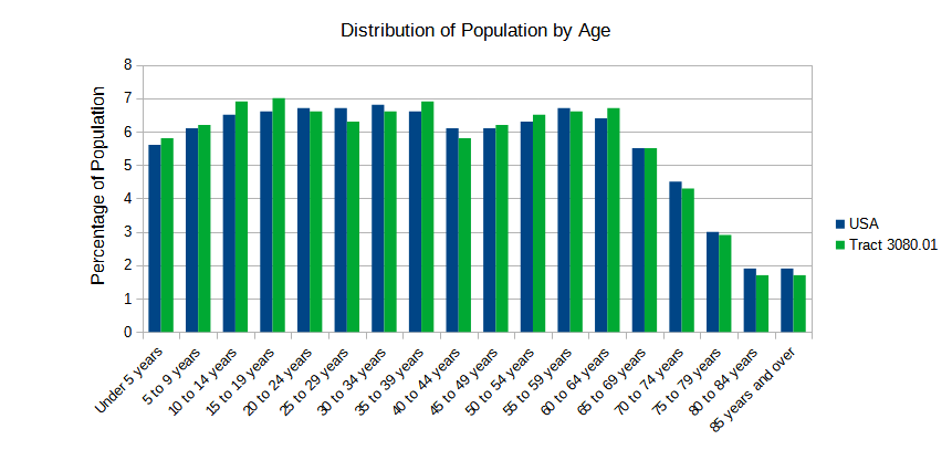
Which tract has the lowest total variance? In other words, which is the closest to the national profile? Turns out is tract 3080.01; in Contra Costa County, California. A section of the city of Antioch, in the far eastern part of the East Bay (San Francisco Bay Area). It’s variance total is 0.0387; here is it’s age profile compared to the nation’s:
At the other end of the spectrum are the least similar neighborhoods. Turns out these are mostly tracts consisting of college dormitories. What about retirement communities? They also rank near the bottom of this list, but not as far down as college dorms. The age distribution isn’t quite as polarizing. Example:
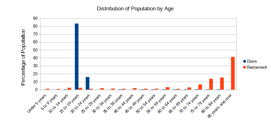
Clearly, neither are representative, but college dorms are more not representative, if I may put it ineloquently.
Next characteristic, Race. There are several ways to slice the race data. The decennial census defines these categories:
- White
- Black or African American
- Asian
- American Indian and Alaska Native
- Native Hawaiian and Other Pacific Islander
- Some Other Race
The American Indian and Native Hawaiian categories represent very small percentages of the population (2.9% and 0.5%, respectively). To keep the group sizes relatively close, I’ll merge those to into the Some Other Race category. So for the purposes of this study, there are four main categories: White, Black, Asian, and Other.
In addition, the census allows a respondent to claim more than a single race, something that now happens about 10% of the time. To incorporate these choices, I’ll distinguish between those responses that specified a single race, and those who specified multiple races. Thus, I end up with the following categories:
| Race | National percentage |
| White (alone) | 55.59% |
| Black (alone) | 11.18% |
| Asian (alone) | 5.41% |
| Other (alone) | 8.80% |
| White (in combination with other races) | 8.47% |
| Black (in combination with other races) | 1.59% |
| Asian (in combination with other races) | 1.12% |
| Other (in combination with other races) | 7.48% |
| Total | 100% |
To determine how close a census tract reflects the nation’s racial makeup, I use the same technique as for Age: for each race category, compare the tract’s values with the nation’s, and sum up the differences. After crunching the numbers, here are the five most representative tracts (those with the lowest total variance):
| Tract | Location |
| Census Tract 2001.06, Henrico County | Suburb of Richmond, Virginia |
| Census Tract 8615.09, Lake County | Suburb of Chicago, Illinois |
| Census Tract 144, Philadelphia County | Philadelphia, Pennsylvania |
| Census Tract 9.03, Grayson County | Suburb of Dallas, Texas |
| Census Tract 21, Tulsa County | Tulsa, Oklahoma |
Here’s how close the winning tract is to the national average:
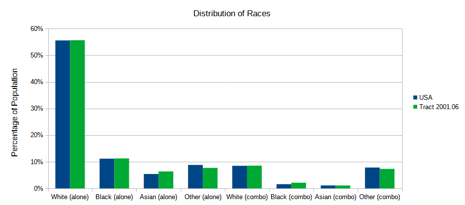
Pretty much spot-on, no?
I’m going to take a little detour here and look at race distributions at the state level. I did the same analysis, but using state percentages. Here are the top states when it comes to matching the national distribution of race:
- Illinois
- Connecticut
- New Jersey
- Virginia
- New York
We have to be careful here. It’s accurate to say that Illinois’ racial distribution most closely matches the nation’s. But that’s all we can say. What’s happening down at the neighborhood level could be very different. A state’s total might match the national average, but the census tracts themselves could be all over the map. As long as they vary in different directions, the total might look representative, even if the parts don’t.
So instead of looking at the state totals, I’ll look at the tract data within each state. I’ll calculate the average total variance across all of the tracts in the state. The lower the number, the more representative the state is at the tract level. With this technique the top five states are:
- Oklahoma
- Oregon
- Colorado
- Washington
- Nevada
That’s right, a completely different list. Illinois drops all the way down to #37! The lesson is, be careful when looking at aggregate totals. They may not reflect reality when you drill down into the details. Here are two statements:
- Overall, Illinois is the most racially representative state.
- At the tract level, Illinois is not very racially representative.
Both are true. And that’s okay. You just need to be aware that apparent dichotomies can occur when looking at data. And what often happens is that people with an axe to grind will choose the data that supports their viewpoint, and ignore the rest.
You’ll notice that this discussion of Race says nothing about Latinos/Hispanics? That’s because the census treats them as an ethnicity, not a race, and the question of Latino/Hispanic heritage is asked separately from that of race. So I’ll treat is separately in this study. And, since this post has gone on long enough, that discussion will have to wait until next time.
2 thoughts on “An Average Neighborhood”