My previous three posts have looked at which small communities (census tracts) are most similar to the national average, for various categories. Today I’ll cover the final category, and then we’ll get to see just which neighborhood most closely matches, as a whole, the United States.
The final category is Political Lean, and it’s a tricky one. The census never asks questions about politics. Most states provide detailed voting data, but these are usually supplied at the level of voting precincts, which are typically not congruent with census tracts. Luckily, someone has done the hard work of mapping precincts to tracts, at least for the 2020 presidential election. I’ll use that as a proxy for how each tract leans politically.
There are some limitations with this data. Although the analysis uses sophisticated techniques to map from precincts to tracts, it is still just an estimate. Also, about 1.7% of the tracts can’t be mapped to precincts. In those cases, I use the county-level voting results instead. So the results are little fuzzier than the other categories. Still, I figure it’s better to have use slightly fuzzy data than to ignore the political inclinations of a neighborhood.
In the 2020 election, which seems like ancient history now, the national vote was Biden 51.3%, Trump 46.9%, Other 1.8%. The closer the tract comes to matching these three percentages, the closer it is to representing a typical neighborhood, from a political partisan point-to-view. And the winner is…Tract 127.01, in Davenport, Iowa. Its vote was an exact match to the national average, down to tenths of a percent.
Here’s a histogram of the how census tracts vote Republican – the length of each is bar is how many tracts across the country voted R, for a given percentage of the vote.
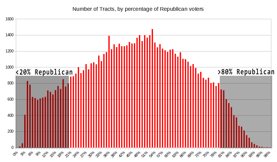
The right hand side of the plot is a smooth bell curve: the larger the Republican/Trump lean, the few tracts there are. In fact, both sides of the curve look pretty much the same until you get to the 20%/80% points. But at that point, they diverge. On the Republican side (the right side), the curve drops down precipitously. On the Democratic side (left), the counts stay higher and actually start increasing around 8% R / 92% D. It then drops down quickly. The upshot is that there are many more “extremely strong” Democratic tracts than Republican ones. If we set the cutoff at 80%, there are 12,465 tracts that are super-strong Democratic, versus just 4,344 that are same from the Republican side. Again, this data is a bit squishy, so we shouldn’t put too much credence in this. But it is an interesting data point.
Whose the averagest of them all?
As a reminder, this is what I’ve done so far: I defined 9 categories for comparison, that might define what a typical neighborhood looks like: Age, Race, Latino/Hispanic ethnicity, Sex, Household makeup (marriage, kids), Homeownership vs. renting, Education, Income, Political lean. For each of these, I calculated a score for each census tract: how far it deviates from the national average.
To get an overall rating across all 9 categories, there are a few more steps I have to do. First, I’m going to normalize the ratings for each category. The goal is to make the range of values the same across all categories. As a reminder, census tracts are “scored” based on how far each data point is from the national average. For example, when looking at Age, there are 18 data points, representing the various age ranges (e.g, “under 5 years”, “5 to 9 years”, and so on). For a given tract, I sum up the difference between the tract and the national average with each of these data points.
For Age, the closest tract to the national averages had a rating of 0.0387 (or, 3.87%). That’s the sum of how much each data point was off from the national average. The tract that was furthest from the national averages had rating of 1.712. The next step is to normalize all of the tract values so that the values all range from 1 to 100, where the closest tract to the national average has the highest value (100) and the furthest has the lowest value (1). So for Age, closest tract value of 0.0387 becomes 100, and the furthest tract value of 1.712 becomes 1.
I did this for all nine categories. So now every tract has nine values, each ranging from 1 to 100, representing how similar it is to the national norm. How should I use these values to determine the most representative tract? I could just use the use the average (arithmetic mean) of all nine categories. But instead I decided to use the harmonic mean. What I’m trying to do is find neighborhoods that “look like” the national average. The advantage of harmonic mean is that is rewards data sets whose values are all close together, and punishes those who have outliers. It does this better than the arithmetic mean. Allow me a small diversion to explain why I think harmonic is better for this case (if you’re not interested, skip to here).
Imagine a simplified comparison, with only three categories: Age, Income, and Education. This table lists the ratings of two imaginary census tracts, One and Two. It uses the same 1 to 100 scale, where 100 is the best match the the US average, and 1 is the worst.
| Tract | Age | Income | Education |
| One | 100 | 100 | 70 |
| Two | 90 | 90 | 90 |
Which of these two tracts is more representative of the national average? Tract One exactly matches Age and Income, but is pretty far off with respect to Education. Tract Two is close on all three categories. I argue that Tract Two better represents the nation, since all of its categories are similar, and very close to the national average. This is where the harmonic mean comes in handy. The arithmetic mean (average) of the three categories is the same for both tract One and Two: 90. But the harmonic mean is different. For Tract One it is 87.5, while for Tract Two it is 90.0. Harmonic mean ‘penalizes’ Tract One for having diverging values, while it ‘rewards’ Tract Two for having similar values. Harmonic mean distinguishes between tracts that have the same arithmetic mean, by giving an edge to the one whose values are closer to each other. One last thing to note: harmonic mean severely punishes tracts that have significant outliers. So if a tract has high scores in most categories, but a low score, say 20, in one of them, it’s harmonic mean will be poor. Which I think is desirable – for a neighborhood to be considered typical, it should have high scores in all categories.
Okay, so after all that, who’s the winner? Which neighborhood most closely matches the national averages? Turns out is is Census Tract 9.03 in Palm Beach County, Florida. Part of the city of North Palm Beach. At least in the categories I chose, that tract best represents America. Here’s how it did:
| Age | Race | Hispanic | Sex | Household | Own/Rent | Education | Income | Political |
| 96.8 | 98.4 | 98.7 | 99.6 | 94.8 | 95.0 | 89.3 | 88.7 | 97.7 |
The harmonic mean of these nine categories is 95.5. This neighborhood may not exactly represent America, but it’s 95% of the way there.
What about the runners-up? Rather than list them, I’ll point them out on a map. Here are the 25 census tracts closest to the US average:
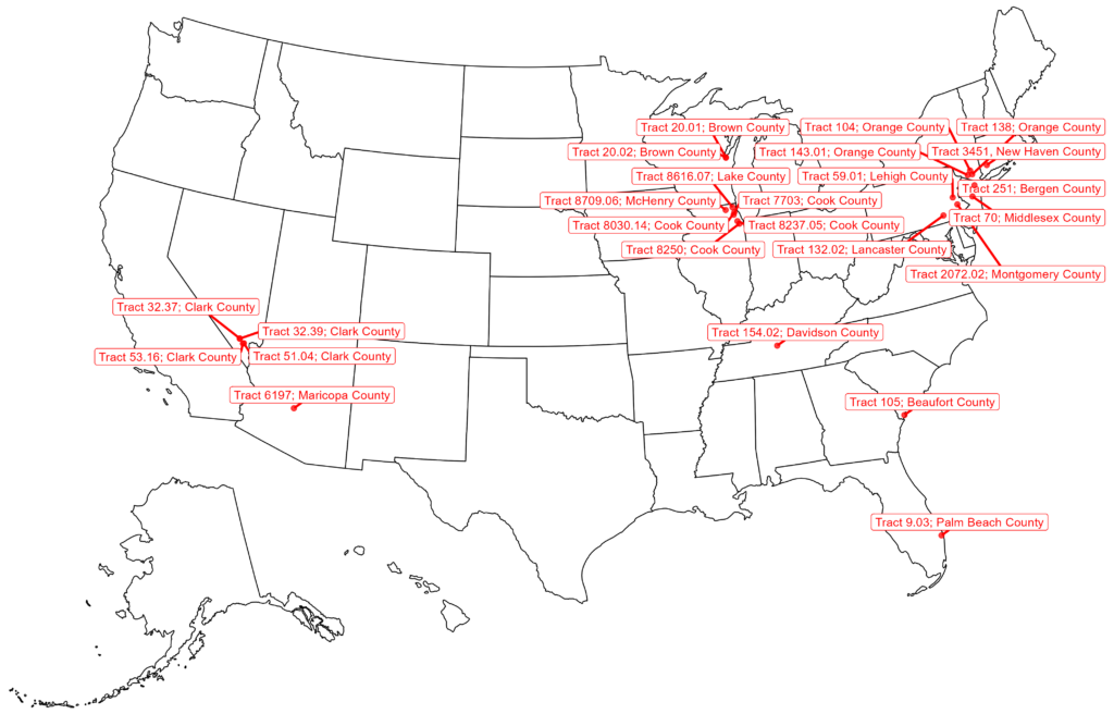
There are several clumps: four tracts around Las Vegas, five in the greater Chicagoland area, three in the Hudson Valley (north of NYC). Vast swaths of the country have no representation.
But that’s just the creme de la creme of averageness; just 25 of over 83,000 tracts (0.03%). Let’s expand it to the top 1000 census tracts. That’s still just the top 1.2% of neighborhoods. Here’s where they are located:
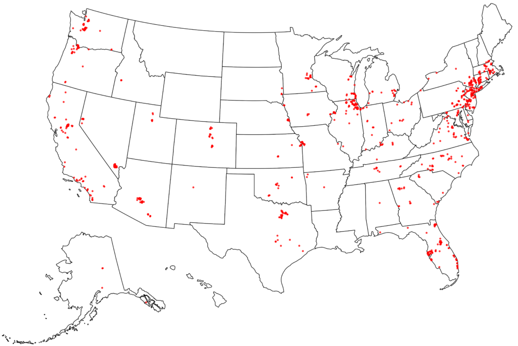
Vegas has a ton (49 to be exact) – you can’t tell because they are all stacked on each other. There are very few in New York City itself, but the surrounding bedroom communities (Hudson Valley, Connecticut, Long Island, New Jersey) are packed with them. Florida has more than its share, especially around Tampa and Orlando. Given its population there are not as many as you’d expect in Texas, and almost all are concentrated in the Dallas-Fort Worth area. California also has fewer than its population would indicate. Not many in the LA region, and none at all in the Bay Area.
I mentioned that overall ranking of some neighborhoods were severely lowered for having one category fall substantially outside the norm. I’ll give a couple examples. First is tract 3021.03 in Los Angeles; Glendale, to be specific. It put up pretty solid numbers and would have finished in the top 1000 were it not for it’s low score (22) in the Own/Rent category. Instead of an ownership rate of 63% (the national average), homes are owned only by 12% in this neighborhood. This pushes them out of the top 1000 and down to the middle of the pack.
And shed a tear for Tract 78 in Multnomah County Oregon, the Maywood Park neighborhood of Portland. Were it not for one “flaw”, they would have made the coveted top 25 neighborhoods for averageness. Here’s how it compares to the nation:
| Age | Sex | Race | Hispanic | Education | Household | Income | Own/Rent | Politics | |
| Tract 78 | 91 | 99 | 94 | 95 | 93 | 94 | 87 | 99 | 52 |
They were looking pretty good (average, that is) until they decided to give Biden a +56 point advantage in the 2020 election (instead of the 4 point lead he had in the rest of the country). The Political Lean score of 52 brought their harmonic mean way down; if not for that deviation, they would have been in the exclusive top 25 list. As it is, they are still in the top 10%.
Finally, here’s a visualization of the ratings for a few states. Click on a tract and see its overall rating, along with the ratings for each of the categories. California, Oregon, Nevada (larger screens preferred for these). Other states available on request. See how typical your neighborhood is!