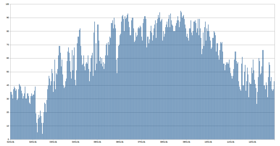
In a given location, the daily high temperature can fluctuate significantly. On the whole it’s colder in winter and warmer in summer (of course), but in a single year, there’s lots of variation day-to-day. For example, here are Chicago’s temperatures in 2021, from January through December:

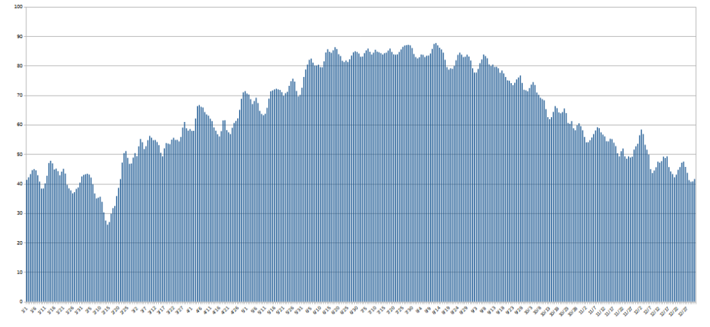
If you take all of the weather stations in the US, and average out their highs for a year, it smooths out the curve significantly. Here is 2021:

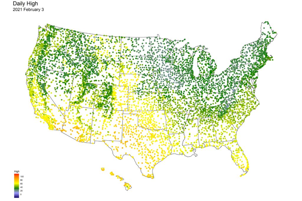
A lot smoother, but there are still fluctuations. These represent the weather patterns (warm and cold fronts) that move across the county. Can we visualize this? Sure. Let’s analyze that big dip in the chart above that happens in mid-February. We’ll start with the high temperatures on February 3rd:

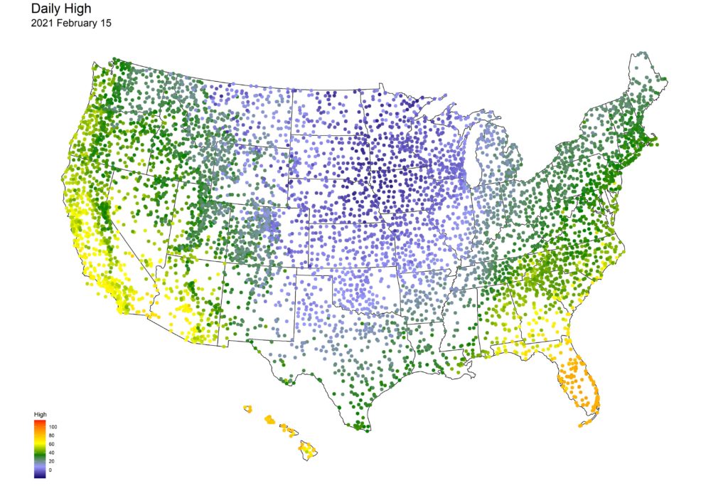
On February 3rd, the north half of the nation was cold, but not frigid. But by February 15th, things had changed:

The Midwest was hit by a massive cold front, with temps dropping well below zero. And remember, these are the highs for the day; the lows were even colder. The front went all the way down to Texas; locales there which two weeks previously had 70-80 degree weather were now freezing.
Let’s watch how this front progressed (February 1 – 16). For these videos, using a larger screen and selecting the full screen button (lower right) is recommended.
Clearly, an arctic blast coming down from Canada.
Let’s have a look at an entire year, using the same ‘time-lapse’ technique. Here’s the temperature map of daily highs of 2021. We’ll speed it up 4x, so it shows the whole year in 49 seconds:
You can really see how the typical weather systems in the US move from west to east (because of the jet stream). In winter, there are occasional cold fronts from Canada, but most of the time you see things move from west to east.
Finally, here’s a time-lapse of every day’s high temperatures, from 1920 through 2021. It’s sped up very fast – each year takes just 12 seconds. The entire video is 20 minutes long, so I’ll forgive you if you don’t watch it all. I do find it quite mesmerizing, though.
