Back in April, the New York Times published an article about the correlation between 2020 presidential voting and Covid-19 vaccination rates. They found that the more a state or county voted for Trump, the lower the vaccination rate. Today I’ll do an update, using recent data.
Not surprisingly, the correlation is still there. The amount varies from state to state. Let’s look at California to start. These graphs plot each county of a state – the horizontal axis is the percentage of votes for Joe Biden, and the vertical axis is the vaccination rate1Specifically, the percentage of population aged 18 and up who are fully vaccinated.
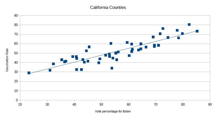
It’s pretty clear – the more a California county voted for Trump, the less likely it is to be vaccinated. The slope of the regression line shows the correlation – roughly, for every 10 points more a county supported Biden, its vaccination rate goes up by 7 percent. The dots are all pretty close to the line, which means that there is high correlation2The Coefficient of Determination (R squared) is .77.
Here are some other states with reasonably strong correlation:
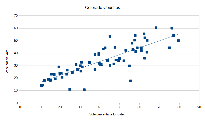
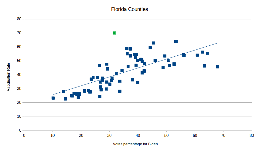
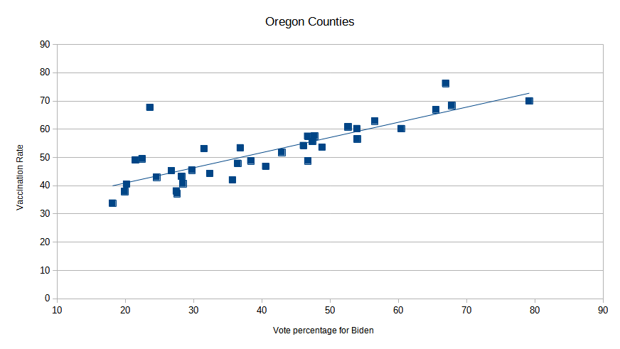
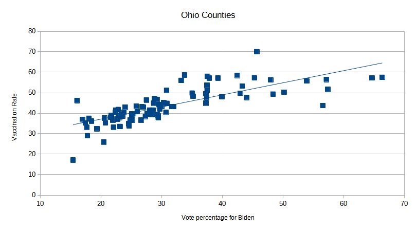
There are a few outliers on each of these graphs, which can usually be explained. For example, there’s a county in Florida with a very high vaccination rate (70%) but voted strongly for Trump (it’s the green dot on the graph). Turns out it’s Sumter County, which has the oldest median age of any county in the US. Older people were a focus of early vaccination efforts, so in this case, at least, vaccines won out over Trump-inspired resistance.
Not all of the states had strong correlation. For example Arkansas has a trend line in the expected direction, but the dots are all over the place:
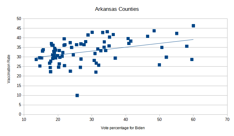
This results in a R Squared of just 0.15. Here’s another state with a very slight correlation:
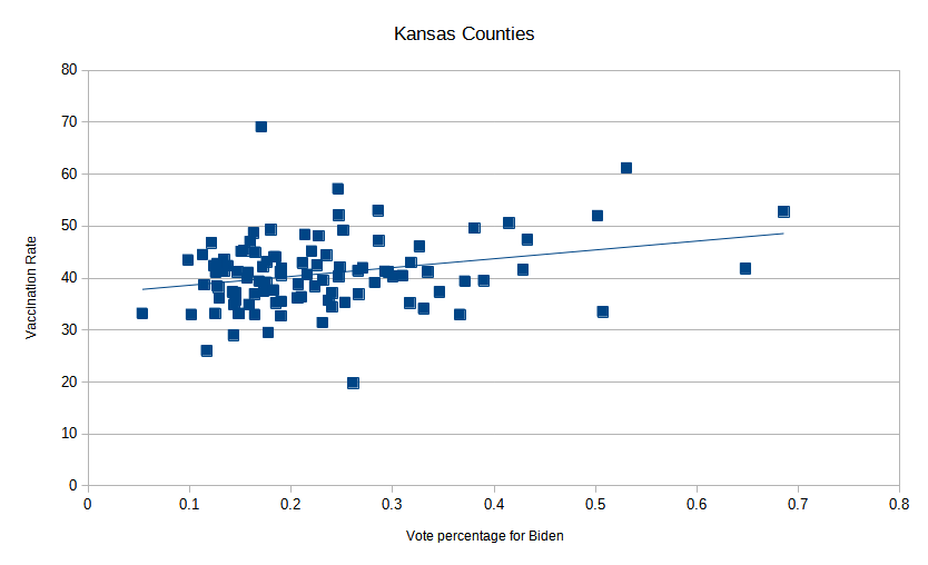
If the line wasn’t drawn for you, you might not have seen any correlation. Why do some states have such a weak correlation? It’s beyond my meager abilities to determine, but since each state had its own mechanism for vaccine rollout, it could be related to that.
Finally, here’s the state with the strongest correlation (R squared of 0.9), Wyoming.
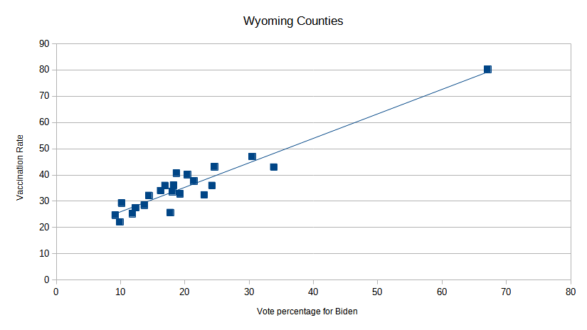
The dots line up pretty much straight on the regression line. The outlier to the right is Teton County. Twice as likely to have voted for Biden, and twice as likely to be vaccinated.
Now, as we all know, correlation is not causation. There could be some other factor that these counties have in common that is the true cause for this. For example, rural counties tend to vote for Trump; perhaps the real reason for this correlation is that rural voters don’t trust vaccines in general. Or maybe there’s some other root cause.
Nah, who am I kidding.
