One last post on the Presidential election data. This one will look at something I call Adjusted Trend. The “trend” part looks at how each county voted, compared to the previous election. The “adjusted” means that I’ll adjust for the overall swing for the country as a whole.
Here’s an example: in the 1996 re-election of Bill Clinton, the county of Atchison, Kansas was D+1.5. In 2000, it was R+3.0. In pure terms, its trend was 4.5 points toward Republican. But, in the 2000 election the country as a whole swung 8 points toward R (D+8.5 in 1996 to D+0.5 in 2000). So adjusting for the national swing, this county actually trended toward D. The country went 8 points toward R; Atchison went 4.5 points toward R, so its Adjusted Trend is 3.5 points toward D. It voted slightly more Democratic than expected.
In typical electoral maps, Atchison will show up as red in 2000, because it voted for Bush. But in an Adjusted Trend map, it is a light shade of blue. These types of maps won’t tell you who won an election, but they will tell you areas that went against the grain, compared to the nation as a whole. A white or pale county means that it pretty much voted as expected.
Let’s take a look at the last five Presidential elections:
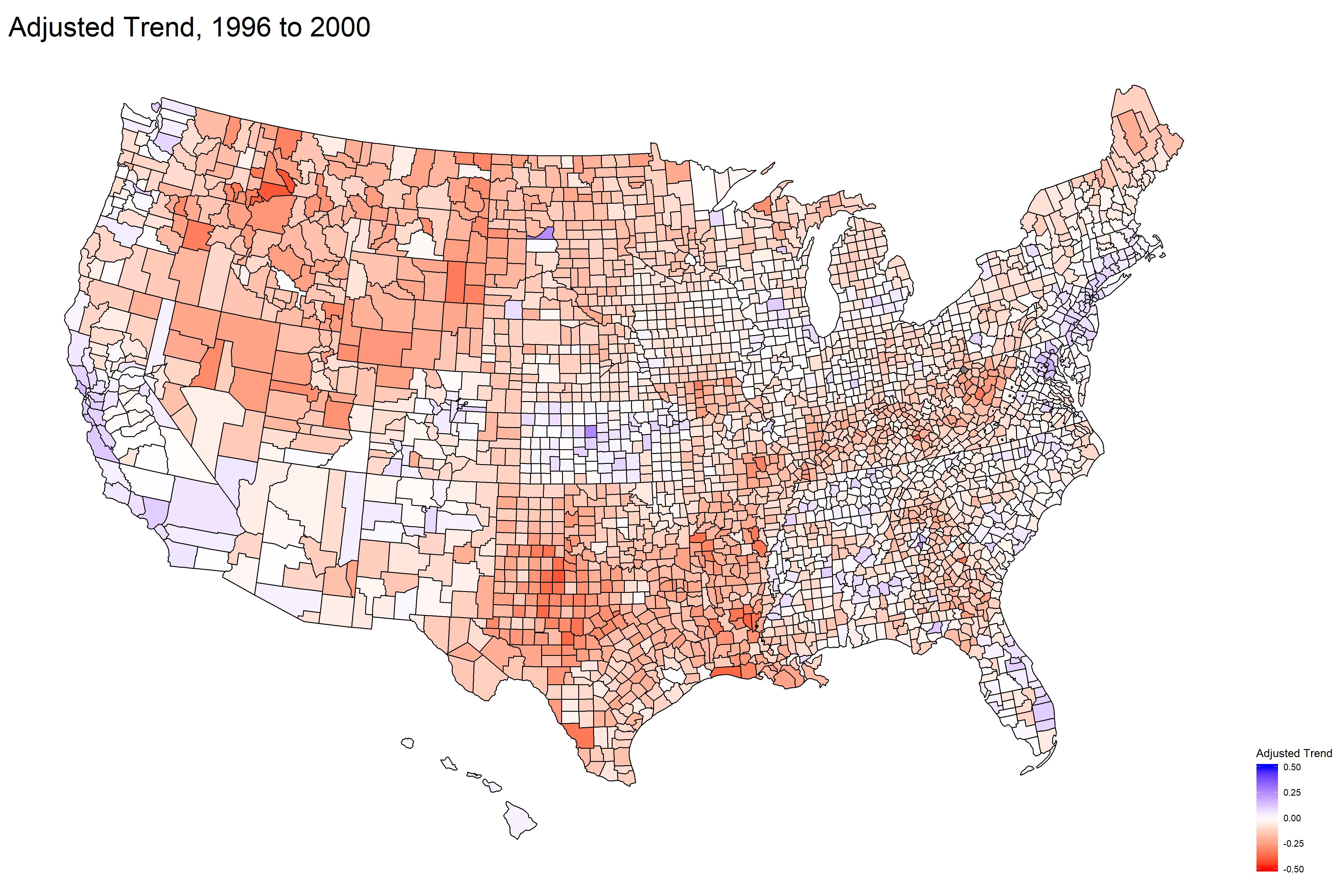
In 2000, with George Bush running for President the “favorite son” effect shows up in Texas. The cattle/mining Western states trend R too. California and pockets of the East trend Democratic.
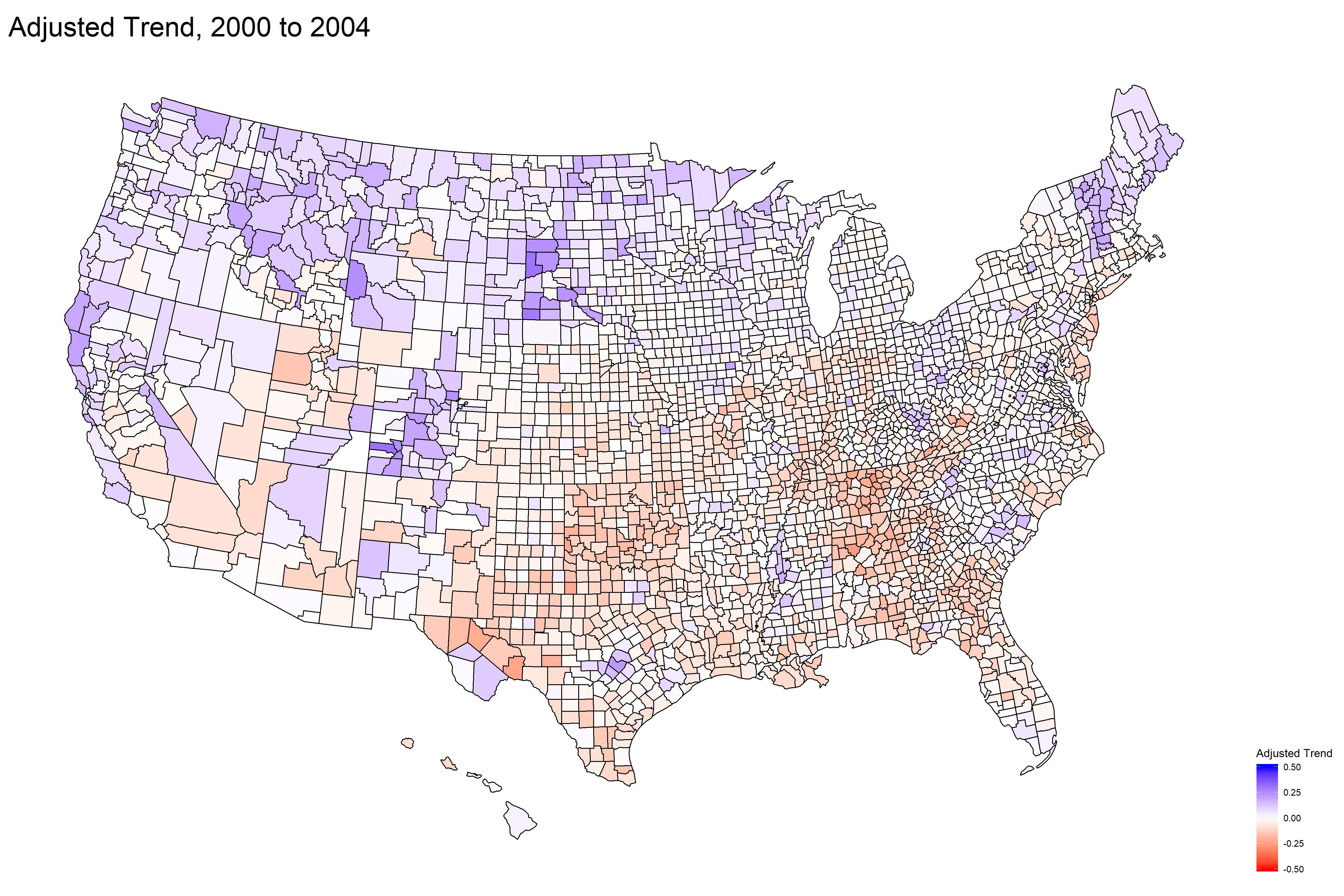
In the reelection of George Bush, most of the country is white or pale. Basically, people voted the same way they did in 2000 (give or take).
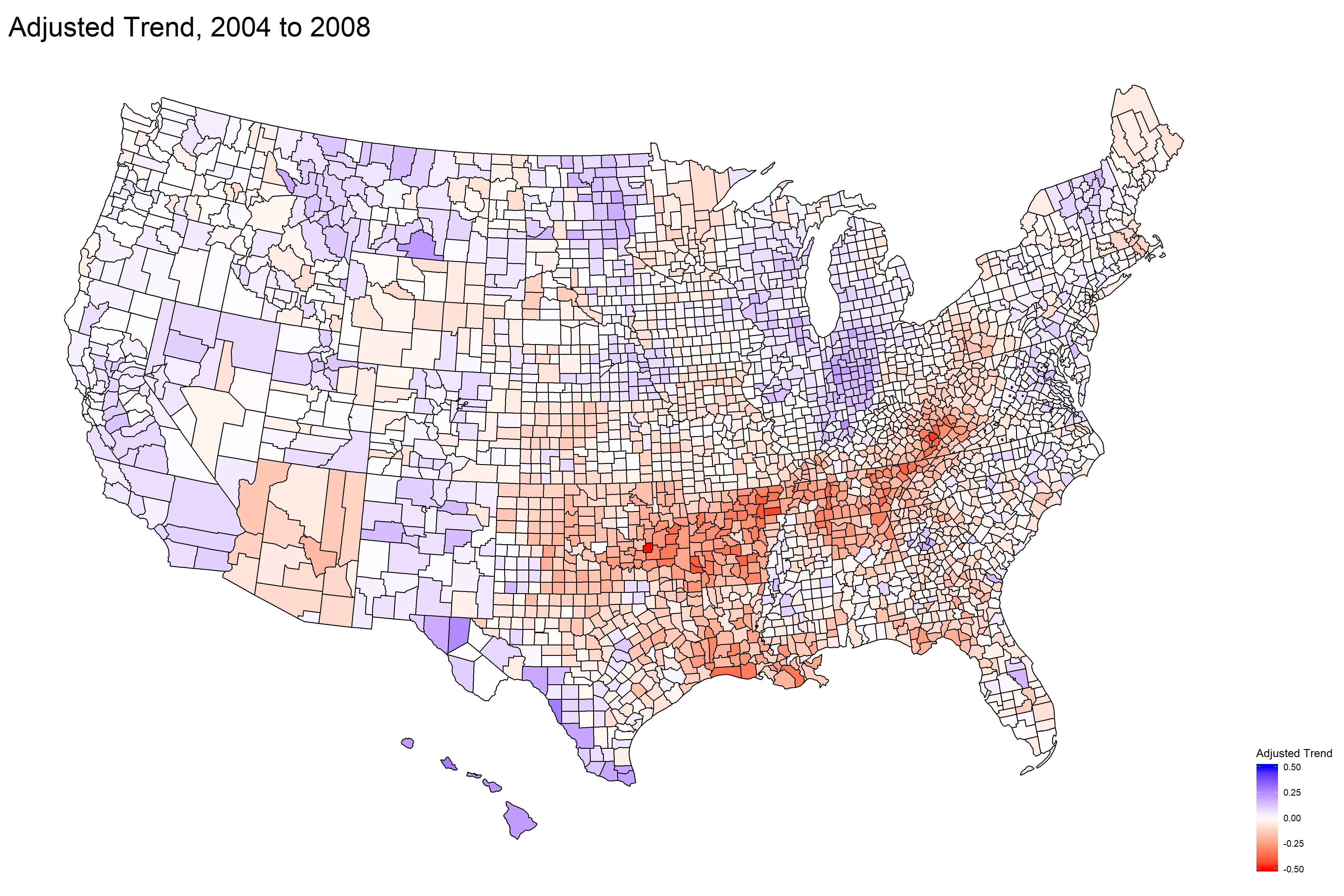
The election of our first black President results in a pretty mild map in 2008. The exception is the band of red through the central South, which went against the 10-point national swing toward the Democrats in a big way.
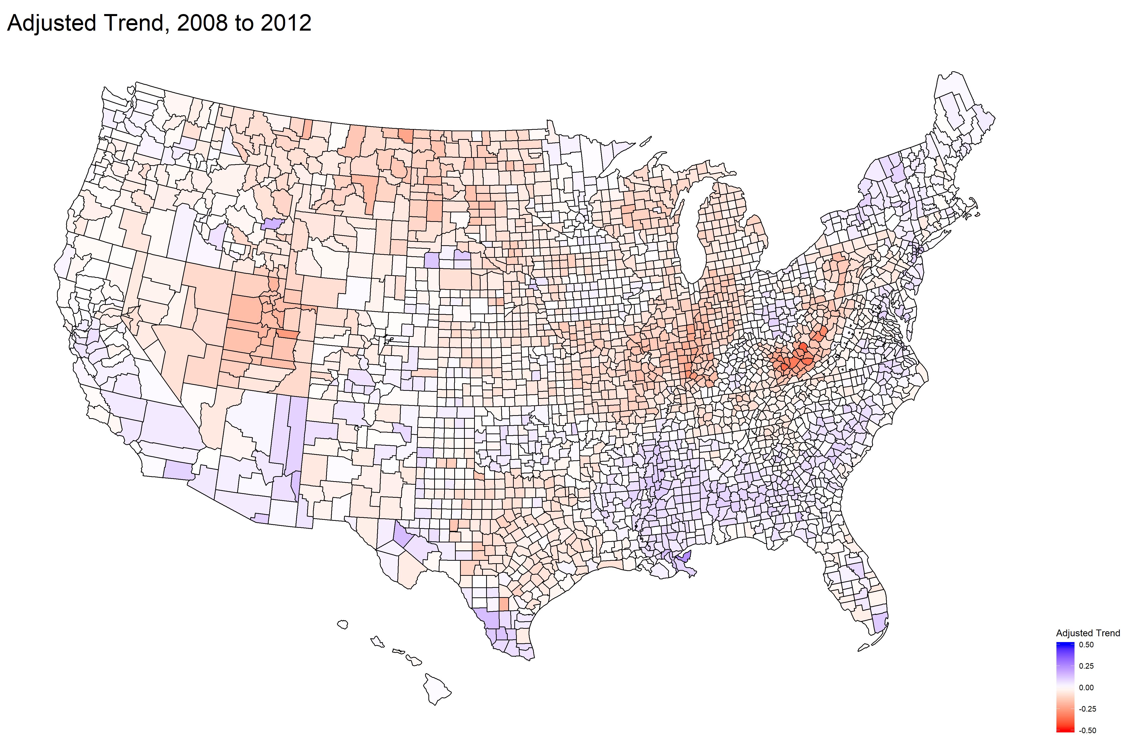
Obama wins again, and the adjusted trends are very mild (except for West Virginia, which continued its speedy turn toward R). Obama’s margin of victory was a bit less, but the electorate pretty much trended as expected. This is least exciting map of recent elections, which leads to…
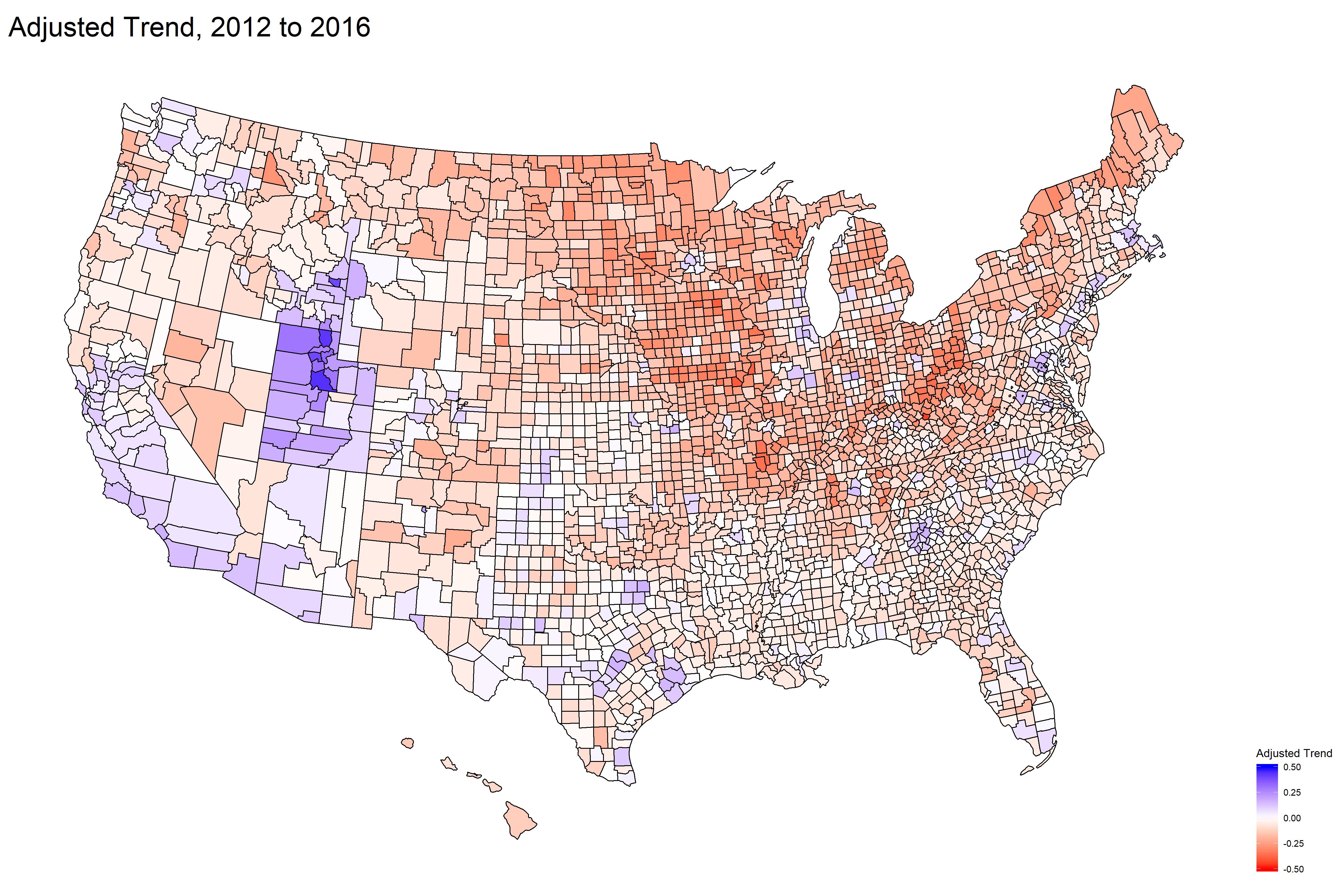
You can see where Trump won the Midwest – states like Ohio, Wisconsin, Michigan, Iowa trended hard toward Republican. California and the East Coast continued their drift left. Utah is an interesting anomaly: in 2012 it was heavily R (voting for Favorite Son Mitt Romney); in 2016 it was a home of the “never Trump” movement. Be that as it may, I’m pretty sure Utah is staying Republican.
