[Recommend a larger screen for this one – PC, or tablet at least].
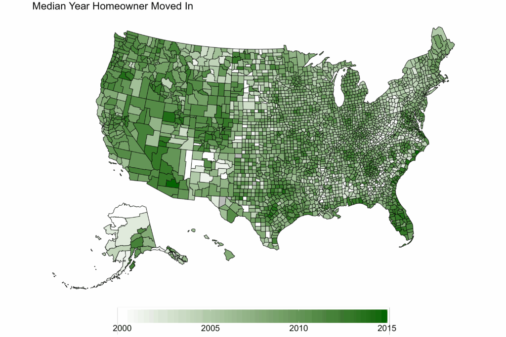
Today it’s more analysis of the American Community Survey census of housing tenure – how long homeowners have lived at their current address. Last time we looked at the state level, today we’ll be getting more granular. Let’s start with counties. Here’s a map of the whole country, showing the median tenure for homeowners. The darker the green, the more recent the average move-in date for each county.
If you blur your eyes a bit you can kind of see patterns here and there. To make things stand out more, instead of a continuous gradient let’s put each county into one of three bins: recent (2010-2015), midterm (2005-2010), and old (2005 or earlier).
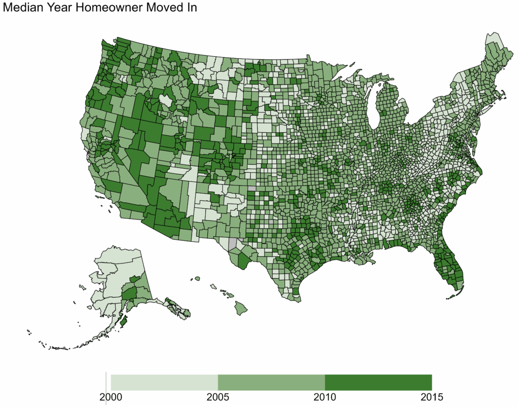
The patterns are somewhat more obvious. We’ll zoom in on the eastern half of the country:
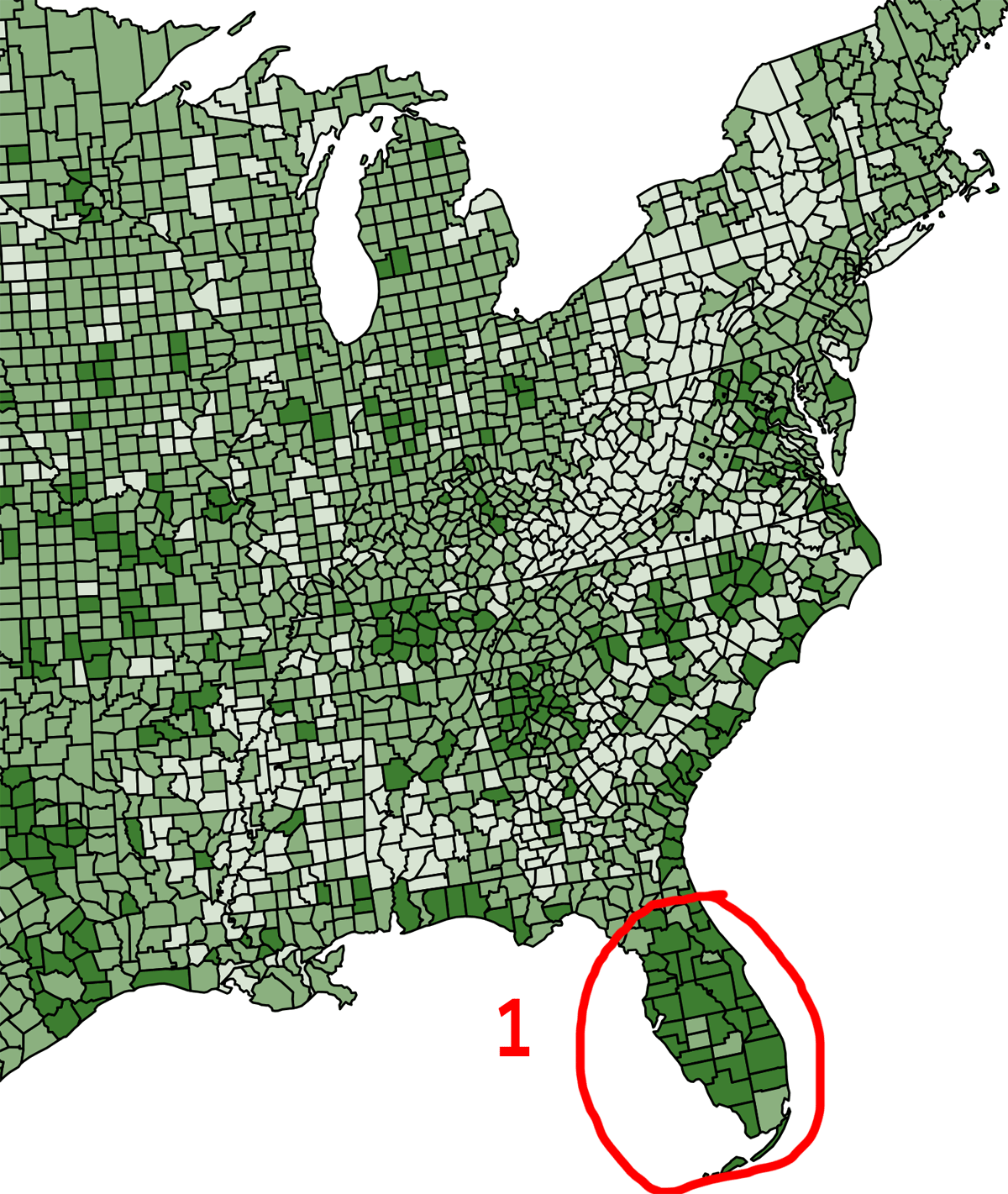
- As mentioned in my previous post, Florida has one of the latest move-in averages of any state. And here you can see it’s evenly spread across the non-panhandle counties.
- Also from last time, we learned that West Virginians don’t move often. Actually it’s part of a swath of counties with long-term homeowners, starting in West Virginia and continuing through western Pennsylvania and much of upstate New York.
- The Eastern seaboard has more recent tenure, indicating high turnover for these locations.
- Homes in rural, non-coastal deep south don’t change hands often, and thus have older tenure.
In the western half of the country, the mountain states generally have more recent tenures. The northern plains tend the other direction, as does much of New Mexico.
What are the root causes for these differences? We saw last time that a state’s growth rate had some correlation with more recent homeownership tenure (high growth -> new housing -> later tenure). This correlation continues at the county level, although it isn’t as strong.1This is somewhat disconcerting – you’d hope that breaking down the data into subgroups would increase the correlation, but sometimes it doesn’t. There are many possibilities here; it could be a variation of Simpson’s Paradox. There are lesser correlations with a couple of other variables: population density (i.e., urban vs. rural) and income level: both of these also push the ownership tenure toward recent years. But combining all of these variables only explains about half of the correlation. There must be other reasons, possibly specific to each region. For example, employment types, societal expectations, historical norms.
One issue I have with county-level data is that there can be massive population differences between counties. Here are two counties I extracted from the first map. I enlarged each of them by the same factor:

Geographically they are similar sizes, even their shapes aren’t all that different. But, as for population…the county on the left is Los Angeles, population 10,014,009.22020 census The county on the right is Sublette, Wyoming, with 8728 souls. To reflect population differences, the relative sizes should be something like this:

So while it’s pretty safe to make some generalizations about Sublette based on county-wide totals, doing the same with Los Angeles county is foolish. While it is technically accurate to say that LA county has a median homeowner tenure of 2006 (and thus is that shade of green), this completely ignores the tremendous variation within different cities, communities, and neighborhoods in the county. Which we can see with a map at the census tract level:
LA county goes from a big blob with a median move-in year of 2006, to a scattered series of communities and neighborhoods with tenures that range from 1990 to 2021.3The gray tracts are those without homes (e.g., LAX airport) or those where the margin of error was too high, usually due to limited data). There’s no particular pattern here; each community/neighborhood likely has their own story as to why the house tenure is that way it is.
San Francisco has a more discernable pattern:
The Richmond and Sunset districts in the western side of the city have older tenures, whereas the closer you get to downtown, the later the tenure. This is especially true South of Market, which is easy to understand. There’s been a lot of new construction in this area, which by definition will push the average move-in date later. The housing stock in the rest of the city hasn’t been changing much, yet some areas are turning over more frequently than others.
Finally, just for fun, here’s San Diego county:
As with LA, there’s no real pattern here. City, suburbs, rural all have a variety of tenures. There are neighborhoods right next to each other with very different tenures.
No major points to make here, except: avoid making blanket statements about counties with large populations. No matter what data you look it, there will be large variations from community to community.
When I look at the SD County map, it’s fun to overlay my recollection of residential land when I arrived mid 70’s. Mira Mesa was small, with vast areas of empty “agricultural zoned” land to the north and west. East of Oceanside, south of Spring Valley, Chula Vista as well. Infill building has covered most county land west of the foothills. Certainly a few million have found the SD life they wanted.
I often wonder if (nationally and globally) any long range vision is looking to match water and energy availability, as well as pollution patterns to migration and development for the future.