The University of California publishes a trove of data regarding applications by high school seniors. For each high school in the state (public and private), it lists the number of applications to each UC campus (and to the UC system as a whole). The data also include the admission rate (how many applications were accepted by the campus) and the enrollment rate (of those accepted, how many actually enrolled that fall). There’s lots of interesting data to look at, but I’d like to start with something that jumped out.
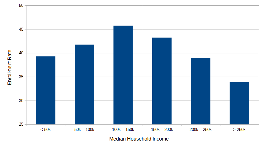
The Enrollment Rate is the percentage of students who, having been admitted to UC, actually enrolled. The following chart shows the enrollment rate versus the medium household income of the high school’s neighborhood1I defined ‘neighborhood’ in several different ways: just the census tract where the school is located, or all census tracts within 1, 2, or 3 kilometers. The results were pretty much the same:

This data is fuzzy, for two reasons. First, it assumes that the students of the school come from the nearby census tracts. Generally this is true, but not always. Second, it is an aggregate measure (at the tract level), whereas decisions students and their families make are singular.
Still, it does provoke a question: why do poorer (and richer) families enroll in the UC system at a lower rate than those in the middle? Remember, these are students who have already been accepted; they’ve made the cut. Here’s my guess:
At lower incomes, some students may not be able to afford the cost of a UC education. Having been accepted to UC, they may instead start with a community college or skip higher education altogether. On the other end, rich families are more likely to be able to afford a private college; the application to UC might have just been a ‘safety’ choice, not needed when private college acceptance came through.
Like I said, just a guess. But I can’t think of a better explanation.
