[As usual for these map-based posts, the bigger your screen, the better.]
Today, let us consider the single-family detached home (SFDH). Specifically, neighborhoods that are made up of them.
I’m going to use the same two sets of data that I’ve used in previous posts: the US Census’ American Community Survey (ACS), and the Microsoft building database. The Census provides housing data at the level of census tracts. A census tract is a small, usually permanent geographical division. Typically their population ranges between 1,200 and 8,000, with an optimum size of 4,000. There are about 73,000 census tracts in the United States.
I want to focus on census tracts that are primarily SFDHs. To identify these tracts, I’ve set a somewhat arbitrary cutoff: at least 90% of the homes must be SFDHs. Only tracts that meet this standard are included.
The next step is to identify whether a tract is a “neighborhood”. This is a somewhat vague term, but the reason for doing this is to eliminate certain extremely rural census tracts that are so spread out there is little connection between the homes. For example, this tract in Maine consists primarily of SFDHs, but it covers 2800 square miles, so it can hardly be called a ‘neighborhood’. To filter out such tracts, I’ve defined a standard based on the MS building database: buildings must cover at least 2% of the land. This eliminates very rural tracts that in no way could be considered a neighborhood, like the aforementioned tract in Maine. The 2% standard means that the homes are reasonably close to one another and the area is somewhat like a neighborhood. Typical suburban areas might have 10-15% building coverage; a tract with 2% coverage is pretty spread out but still has a neighborhood feel, or at least is a collection of similar neighborhoods.
Applying these two filters results in about 6600 census tracts (out of an original 73,000 across the country). Let’s take a look at some of the characteristics of these.
First, the average age of homes. Note that this calculation is very rough; the census data provides housing age data in 10-year ranges. Also, the data ranges only go back to ‘built before 1940’, so all homes built in 1939 or earlier are included in the same bucket. So there may be some neighborhoods with extremely old homes that don’t get credited accurately, thus affecting the average. So be it.
Given that, the oldest SFDH neighborhood is this one in Wichita, where most homes date to the 1920s:
Close behind are the Grant Park area of Portland (Oregon), Brookside Park of Kansas City, and South Akron. Unexpectedly, two California neighborhood crack the top six: Oakland (Trestle Glen) and Pasadena (Casa Grande). In all of these neighborhoods, a vast majority of the homes date from the 1930s or earlier. They are all nice neighborhoods, which makes sense – homes in lousy neighborhoods don’t last 100 years.
At the other end of the spectrum, it’s impossible to identify the SFDH neighborhood with the newest homes, because new homes are being built as we speak. But given that limitation, and using the 2019 ACS data, the newest is this neighborhood in Mesa, Arizona. As you can see, it was still under construction as of the latest Google maps drive-by.
Next, home size (as defined by number of bedrooms). There’s one state that dominates the list of SFDH neighborhoods with the highest average bedroom count. It has the top 3, and 26 of the top 100. Care to guess which state? That’s right, Utah, with this neighborhood in Orem leading the way at 4.72 bedrooms per house:
Simple reason: big Mormon families. Other than in Utah, the big house communities are in places like Scarsdale, NY, Langley, VA, and Alpharetta Woods (outside of Atlanta). Basically, toney exurbs of major cities.
Regarding these big houses, there’s something interesting I noticed. Glancing at the Utah neighborhoods with street view, the houses didn’t appear monstrous. Compared to other large-house neighborhoods, they seemed scaled more like typically suburban homes. So I did a quick analysis – I took the top 100 SFDH neighborhoods (by number of bedrooms) and divided them into two groups: those in Utah (26) and those not (74). The average number of bedrooms for the two groups was the same (4.35). But the footprints of the Utah houses averaged 14% smaller. Houses built for Mormons pack the same number of bedrooms into 430 fewer square feet. Why? My theory: efficiency vs. ostentatiousness. Mormons need a 5-bedroom house because they have a large family; they don’t need a McMansion to show off.
At the other end of the spectrum, the smallest homes are found in five tracts in a retirement community near Toms River, New Jersey. Almost exclusively 2-bedroom homes. Most of the neighborhoods at this end of the list are in retirement communities, which is not surprising when you think about it. The exception is the Brook Village area of Wichita Falls, Texas, which seems like a nice enough place but the homes average 2.1 bedrooms. No doubt the realtor ads use terms like “cozy” and “intimate” a lot.
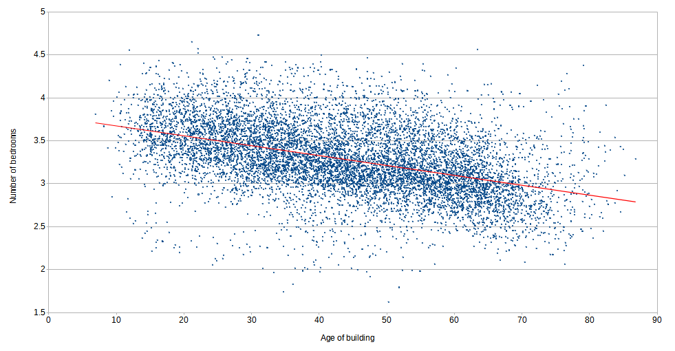
Finally, we know that new home sizes have increased over the years. Does the census data show this? Here’s a plot of all 6600 SFDH neighborhoods. The X axis is the average age of the homes in the tract; the Y axis is the average number of bedrooms. The data is all over the place, but if you draw trend line, you see that the newer houses tend toward more bedrooms; about one additional bedroom over the past 70 years.

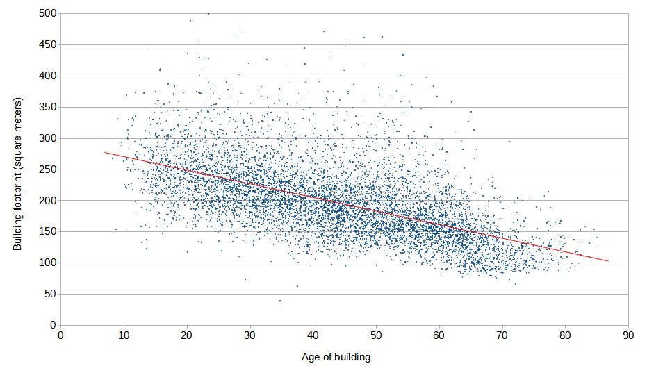
Using the Microsoft building footprint data results in a similar chart. In fact, the external footprint of homes has more than doubled in the past 70 years.

So, we’ve looked at the extremes of SFDH neighborhoods: old, new, big, small. But about more typical neighborhoods? Neighborhoods that represent the average, not the extremes. We’ll cover that next time.

My guess for the increase in footprint and rooms is a combination of the “American dream” coupled with more efficient building costs. But it will be interesting to see data on typical neighborhoods.