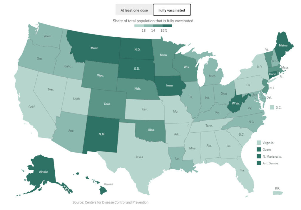
The New York Times has a lot of good COVID info; one of their pages tracts the vaccine rollout rate per state. Here’s today’s graph:

This is known as a ‘heatmap’ – it uses colors to differentiate the values of the regions (here, states). In this case, it’s a ‘binned’ heatmap – the map uses a discrete set of colors (four), defines a range of values for each, and ‘bins’ each state into the appropriate color. The four bins are (from light green to dark green):
- < 13%
- 13-14%
- 14-15%
- > 15%
This technique is helpful for quickly visualizing differences, but it has some problems. Small differences can be exaggerated, and large differences can be hidden. For an example of the former, notice that Louisiana and Florida are different colors, even though their rates are effectively the same (one is slightly above 13% and the other slightly below). As for the later, consider Alaska and Maine; both display as dark green, even though Alaska’s rate is 28% higher (19.6% vs. 15.3%).
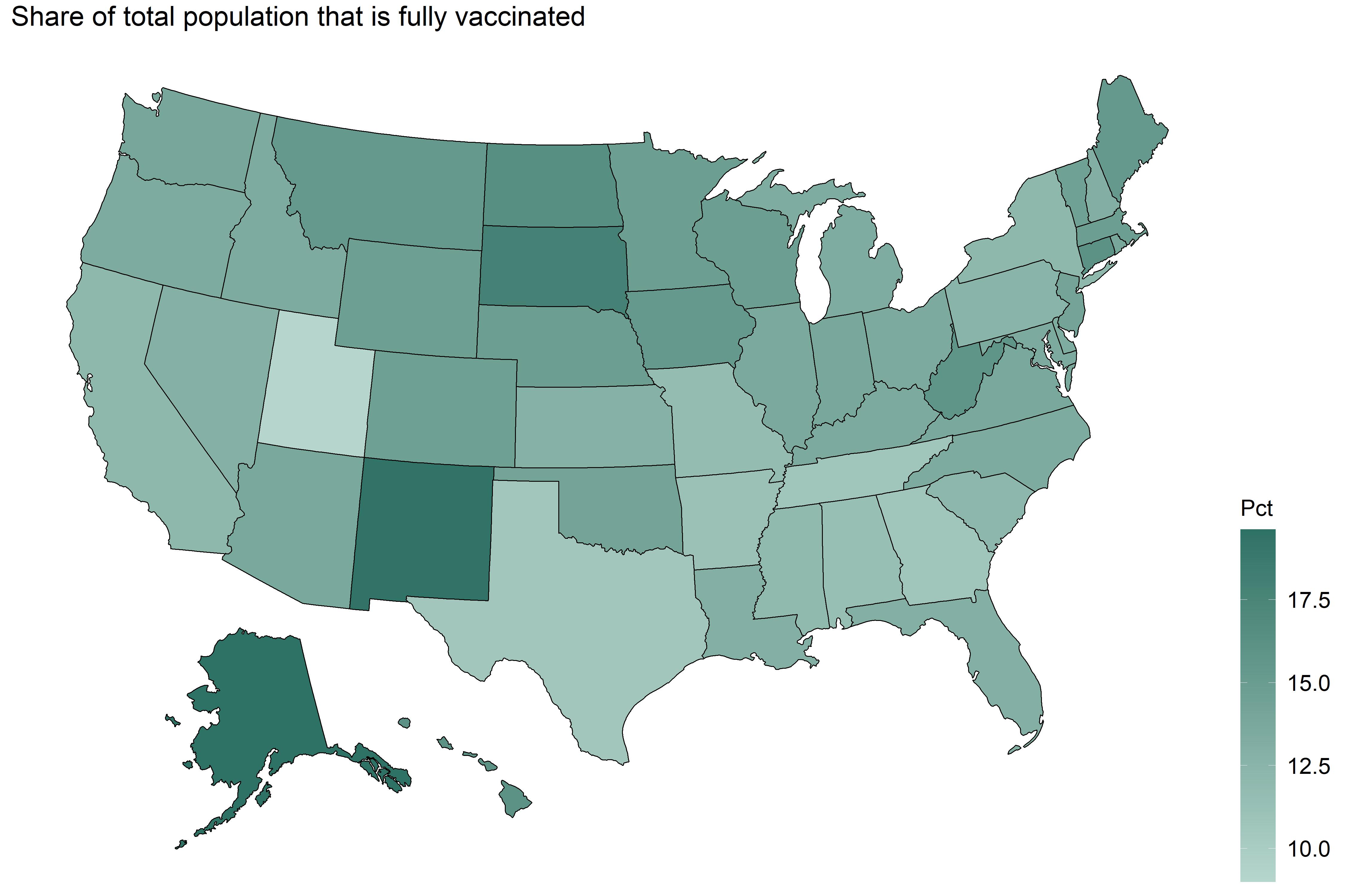
The alternative is to use continuous colors for graphs like this, instead of binning the data.

This graph uses the same color range, but no binning: a continuous scale from lightest (Utah) to darkest (Alaska). The differences between states are subtler, but you can still see the winners and losers.
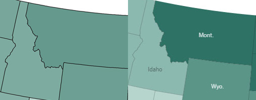
The flaws of the binned approach are clear if you compare the neighboring states of Montana and Idaho. Their vaccination rates are pretty close (15.4% vs. 13.4%, respectively). In the continuous scale, this small difference shows up as a, well, small difference. In the binned graphic, it appears that Montana is kicking Idaho’s rear.

I understand why binned is used – it’s punchier, and makes differences more obvious. On the other hand, exaggerating small differences is another way of saying that it’s less accurate.
