A graphic showed up on Instagram recently containing an interesting factoid about the Gross Domestic Product of the United States.
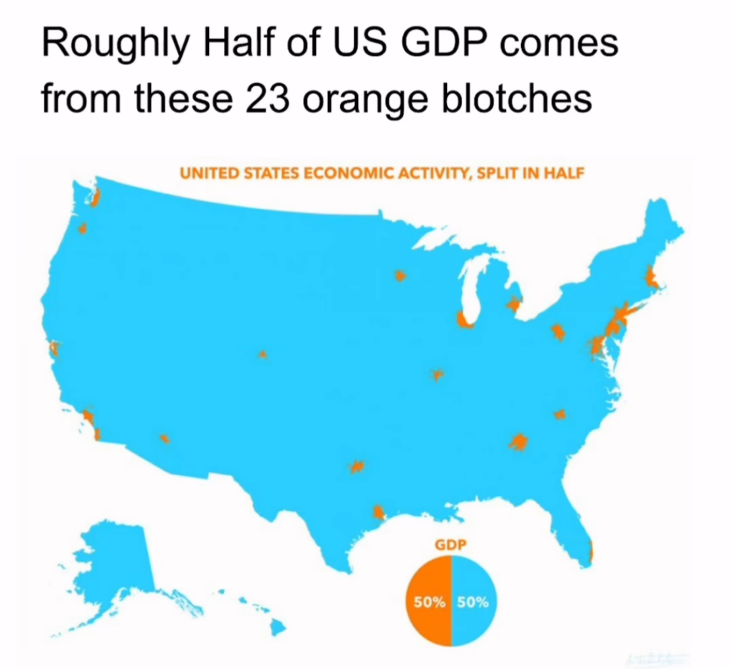
Pretty amazing, right? Actually, not as amazing as it seems.
I did a little digging and found what is likely to be the source of this: a USA Today article from 2019, which includes this graphic:
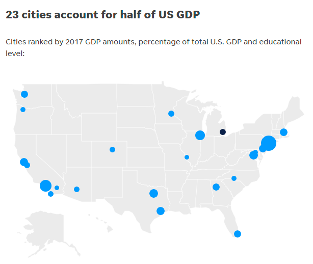
There’s a pretty good match between the blue dots and the orange blobs. Looks like someone started with the USA Today graphic and modified it a bit. I’m not sure how they came up with the size and shape of the orange blobs. The blobs imply the physical area of the cities in question (but that turns out not to be the case). The blue circles in the USA Today map certainly do not represent the area of these GDP centers: instead, it’s the relative size of the GDP (e.g., New York circle is biggest, Los Angeles next, etc.).
Anyway, I traced down the original source data, which is from the Bureau of Economic Analysis, and is from on 20171Using more recent data doesn’t change the results much. It’s not based on “cities”, but on Metropolitan Statistical Areas (MSA). An MSA is “a geographical region with a relatively high population density at its core and close economic ties throughout the region.” Typically, it’s a lot more than just a city – it’s an entire metropolitan area that can encompass many cities. The “New York-Newark-Jersey City” MSA is the largest in the country (population over 19 million), and includes communities from four states. The next largest is “Los Angeles-Long Beach-Anaheim”, which what basically the sprawl of “L.A.”
Let’s look at the actual sizes of these 23 metropolitan areas
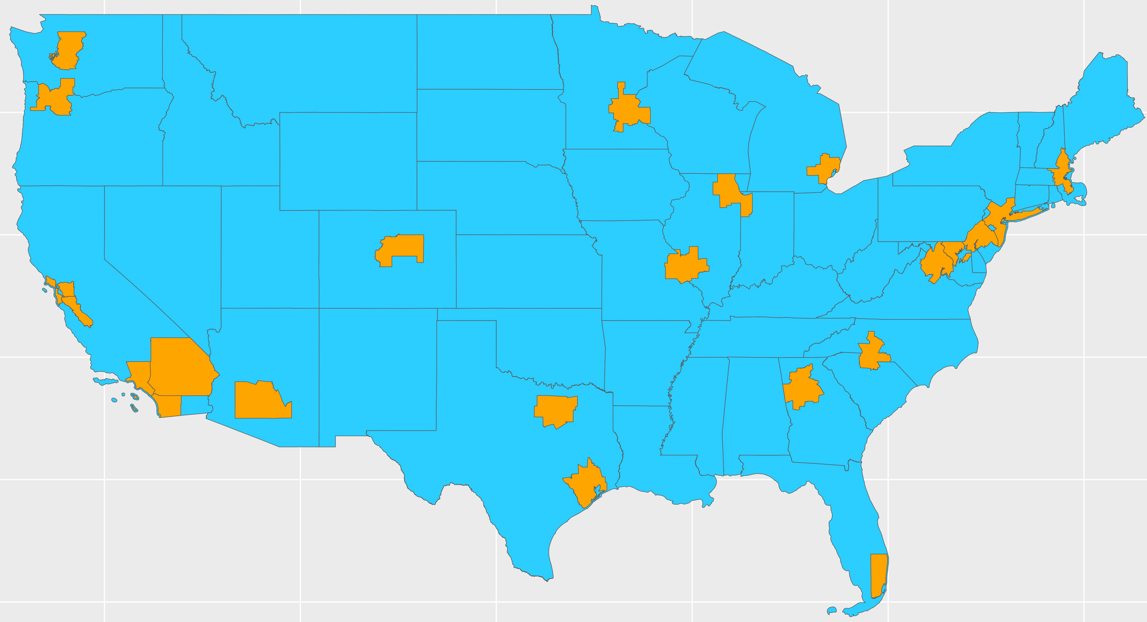
These are a lot bigger than the tiny orange splotches in the Instagram post. Again, I don’t know how that original graphic was created, but it doesn’t represent the MSA boundaries. And the GDP data is based on MSAs.
Another thing to consider is that these 23 metro areas contain 40% of the country’s population. Is it really that shocking that 50% of the GDP comes from 40% of the population in these highly-concentrated regions? Yes, they are above average GDP producers, but not massively above average.
It seems like the Instagram graphic was trying to say, “look how much GDP comes from just a tiny slice of America”. But to make it more dramatic, it does two sketchy things: 1) it visually shrinks the physical size of the metro areas, and 2) it leaves out an important piece of context: that these locations represent nearly half of the US population.
It makes for a punchy graphic. But the truth is more nuanced.
I like your take on this, and will go one step further. I’m skeptical how the data creators define GDP. Their map makes me think humans moving numbers on a ledger must be production. Granted there is always some value add taking place in large metro areas.
Intuitively I see the rural California Imperial Valley, Central Valley, Sacramento Valley, a lot of the Great Planes, the agricultural South, and other US regions, as our food and cotton production sites.
Rural Pacific NW, and other northern states, maybe Georgia and some southern states as lumber production sites.
The fly over empty Permian Basin, and Bakkan regions, energy production.
More than a half century ago, when I was a small child, my dad taught me the definition of “necessities” is food, clothing, shelter.
Thanks for your number dives, as always.
GDP includes services, which can be financial services, health care, education, etc. They all count toward the GDP, although I’ve always thought that some financial services, the “let’s make money by slicing and dicing financial components” type, are not the best use of our country’s brain power.