Something is happening in this country. Increasingly, people live near others who vote the same way as they do. This amazing New York Times article analyzes the 2016 Presidential vote at the precinct level. To quote the article:
On the neighborhood level, many of us really do live in an electoral bubble, this map shows: More than one in five voters lived in a precinct where 80 percent of the two-party vote went to Mr. Trump or Mrs. Clinton
I don’t have precinct-level data for the past six Presidential elections, but I do have data at the county level. I’ll look at how competitive these counties have been over the elections between 1996 and 2016.
I’ll define three types of counties, based on how close the D vs. R vote was:
- Competitive. These are counties where the difference between the two parties is within 10 percentage points. So, from D+10 to R+10. Roughly, 55%-45% or closer. These are toss-up counties.
- Solid. These are counties where a party wins by between 10 and 30 points. They lean strongly toward one party or the other. A typical result here might be 60%-40% (20 points).
- Landslide. This is a county where the a party wins by 30 points or more. We’re talking winning by 2 to 1 ratio, or even more. These are counties dominated by one party or the other.
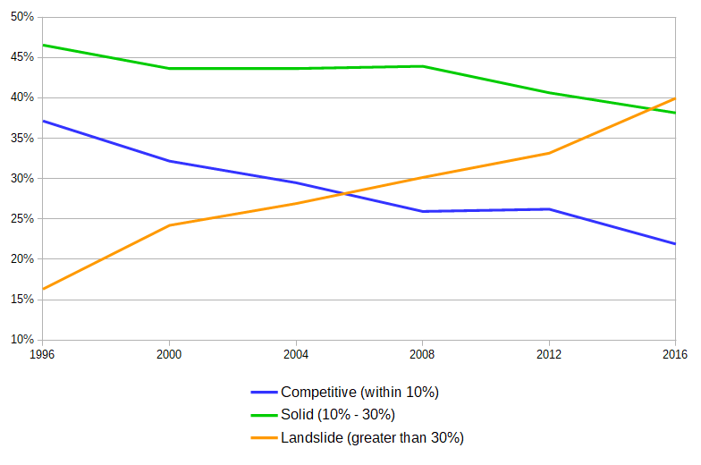
For each election, I totaled the number of voters in Competitive, Solid, and Landslide counties. Here are the results of the past six elections:

That’s a fairly stunning graph. Back in 1996, a vast majority of voters lived in either Solid counties (47%) or Competitive counties (37%). Very few (17%) lived in Landslides. This has changed in a steady but dramatic way, so that by 2016, more voters live in a Landslide county than any other kind.
There are a couple of things to note. One, this is county data, so it has nothing to do with redistricting or Gerrymandering. County lines almost never change. This means that within the same geographical area, a populace that used to be fairly evenly split between the parties now heavily prefers one over the other.
Second, this has been happening consistently over the past several elections. There wasn’t a single event that caused this – each election has resulted in a further polarization of the electorate. You can’t point at 2008 (the first African-American candidate) or 2016 (Trump) and say “that’s where it happened” – the graph clearly shows that this has occurred steadily and continuously since 1996. In each election, dozens of counties jump to be less competitive, and usually stay there.
There’s a sorting happening; more and more people are ending up in counties where ‘everyone’ votes that same way. There are a couple of explanations:
- The demographics of a county change. That is, a self-sorting happens – people are moving to counties that lean toward their beliefs. The new voters coming in are of a different political persuasion than the voters who leave.
- The existing people within a county are gravitating toward a particular party.
In short, #1 is “different people come to the county” and #2 is “the people in the county are the same, but their politics change”. Certainly it’s a mix of both. I lean toward #2 more than #1. Some of these voting changes are pretty abrupt: you can’t explain a 25% change from one election to the next by demographic changes (especially since Americans are moving at a record low rate).
Whatever the cause, it’s pretty clear we are increasing living on electoral islands.

That is really astonishing!